 Daft Punk Logo PNG
Daft Punk, the legendary electronic music twosome from France, emerged in the heart of Paris in 1993, founded by the visionary Thomas Bangalter and Guy-Manuel de Homem-Christo. Distinguished by their unique robot alter-egos and pioneering musical style, they transformed the landscape of dance music with groundbreaking albums such as “Homework” and “Discovery”. Their artistic fusion of house, techno, and disco propelled them to international stardom, with chart-topping tracks like “One More Time” and “Get Lucky”. Beyond their auditory contributions, Daft Punk’s impact permeated the realms of visual arts and fashion, cementing an indelible influence on the electronic music domain.
Meaning and history
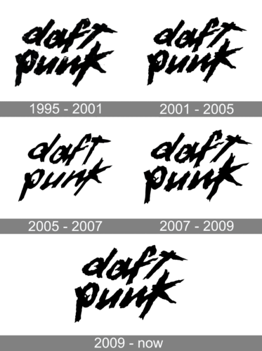
Daft Punk, a visionary French duo, embarked on their musical journey in 1993 in Paris. Formed by school friends Thomas Bangalter and Guy-Manuel de Homem-Christo, they initially experimented under the name Darlin’ before evolving into Daft Punk, a nod to a critic’s dismissive review.
Their debut album, “Homework” (1997), was a revolutionary blend of house, techno, and funk, setting the stage for their innovative impact on electronic music. The follow-up, “Discovery” (2001), with hits like “One More Time”, solidified their global stature, introducing a unique mix of disco and synthpop. Their persona, featuring robotic helmets and anonymity, became iconic, paralleling their music’s futuristic aura. “Random Access Memories” (2013), featuring the chart-topping “Get Lucky”, showcased a shift towards a more organic sound, winning five Grammys.
Despite their disbandment in 2021, Daft Punk’s legacy endures, marked by their pioneering sound, enigmatic identity, and influential visual presentation.
What is Daft Punk?
Daft Punk, an enigmatic French duo, revolutionized electronic music with their robotic alter-egos and groundbreaking soundscapes. Merging house beats with a visually captivating aesthetic, they crafted timeless hits and left an indelible mark on the global music scene.
1995 – 2001
The logo radiates a raw, underground vibe, with its black brushstroke letters sprawling across a stark white backdrop. Its edgy, almost graffiti-like texture conveys a rebellious spirit, synonymous with the duo’s innovative approach to music.
2001 – 2005

This iteration of the logo presents a more balanced and pronounced contrast, with the black strokes becoming bolder and more defined. The letters in “daft punk” are stark against the white, conveying a sense of clarity and artistic confidence. This design retains the raw edge of its predecessor while achieving a cleaner finish, reflecting the duo’s evolving brand.
2005 – 2007
In this logo rendition, the brushstrokes are sharper and more pronounced, exuding a dynamic and bold flair. Each letter’s edges are meticulously jagged, giving the impression of movement and energy. This design iteration is a visual echo of Daft Punk’s evolving and assertive musical direction.
2007 – 2009

Daft Punk embarked on a series of festival performances and tours, throughout which they chose to adopt a retro aesthetic for their branding. This strategic decision marked a deliberate shift away from contemporary designs, embracing a nostalgic vibe that harkened back to earlier eras of their career. This move was not merely about aesthetics but also served to reconnect with long-time fans while intriguing new audiences. The duo’s choice to return to a more traditional style underscored their versatility and deep appreciation for the roots of their genre, setting them apart in a rapidly evolving music landscape.
2009 – Today
Daft Punk embarked on a new chapter in their illustrious career, marking the beginning of distinct branding phases with their involvement in the ‘TRON: Legacy’ project. This pivotal moment laid the groundwork for a more intricate and nuanced visual identity, which they carried through the era of ‘Random Access Memories’ and beyond, even after announcing their retirement. The evolution in their branding strategy introduced a level of complexity and depth previously unseen, reflecting their growth as artists and their ability to adapt and innovate. This transition not only signified a new aesthetic direction but also encapsulated their journey, blending their music with visual artistry in a way that continued to captivate audiences worldwide. Their post-retirement phase still sees the influence of these branding decisions, showcasing their lasting impact on the music industry and their enduring legacy as pioneers of electronic music. The refinement in their branding elements during these periods illustrates a deliberate move towards a more sophisticated and layered approach, emphasizing their artistic vision and the thematic depth of their projects.


