 TP-Link Logo PNG
TP-Link, a renowned name in the world of networking products, stands out for its extensive range of reliable and innovative solutions. Founded by Zhao Jianjun and Zhao Jiaxing, two brothers, the company has carved a niche in manufacturing products that cater to wireless network needs, including routers, range extenders, switches, and more. Operating on a global scale, TP-Link has established a significant presence in various countries, offering networking tools that are both accessible and efficient for homes and businesses alike.
Meaning and history

TP-Link was brought to life in 1996 by Zhao Jianjun and Zhao Jiaxing, who embarked on a mission to provide networking solutions that resonated with the evolving technological landscape. This period marked the beginning of an era where connectivity became pivotal. TP-Link rose to the challenge, introducing a series of groundbreaking products that revolutionized the way people accessed the internet. The company’s journey was marked by significant milestones, such as the launch of their first wireless product in 2005, which played a pivotal role in making wireless technology more accessible.
Fast forward to the present, TP-Link stands as a leader in the global market for networking products. Its commitment to innovation and quality has not only garnered a loyal customer base but also ensured its stature as a go-to brand for reliable networking solutions. The company’s current position reflects its ability to adapt and thrive in the ever-changing world of technology.
What is TP-Link?
TP-Link is a global provider of networking products, renowned for its innovative and reliable solutions in the realms of wireless and broadband networks. The company’s influence extends across the globe, contributing significantly to the way individuals and businesses connect and interact in a digitally-driven world.
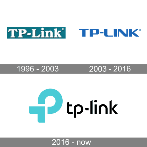
1996 – 2003

The first logo is an older version of the TP-Link logo. It features a light blue background with a white border and the company’s name in white, serif font. The “TP-” part is set left the word “Link,” which is larger and more prominent. This design conveys a classic and straightforward brand image, suggesting reliability and a no-nonsense approach to their products and services.
2003 – 2016

The logo represents a more modern era for TP-Link, with a transition to a minimalist design. The company’s name is presented in a bold, sans-serif typeface, using a uniform, dark blue color. There is a clear emphasis on the “TP-LINK” wording, with the registered trademark symbol at the end, showcasing a more contemporary and professional brand identity.
2016 – Today

The current logo depicts a significant rebranding, with a stylized “TP” in a unique, rounded typeface that almost forms a closed loop, suggesting connectivity and network integration. The color has shifted to a lighter, more vibrant shade of blue, symbolizing innovation and technology. The word “tp-link” is written in lowercase, sans-serif letters, creating a modern, approachable, and dynamic corporate image.


