
The development of the Guinness harp trademark is closely linked to the history of the brand’s packaging and advertising. Until the 20th century, Guinness was supplied in bulk to bottling firms and publicans, who transferred it from wooden casks to bottles. When bottling Guinness, each bottler or pub owner used their own label, resulting in the appearance of a range of names and label designs.
To protect the brand amidst overseas growth throughout the 19th century, the company created its own trademark bottle label. This label, introduced in 1862, was the now famous, buff-coloured oval. It was the first step toward establishing a Guinness visual identity. The company printed and supplied the label to its bottlers, who had to guarantee they’d sell “no other brown stout in a bottle.” It was an early form of quality control, ensuring the pub owner wouldn’t “mix” various stouts and call it Guinness.
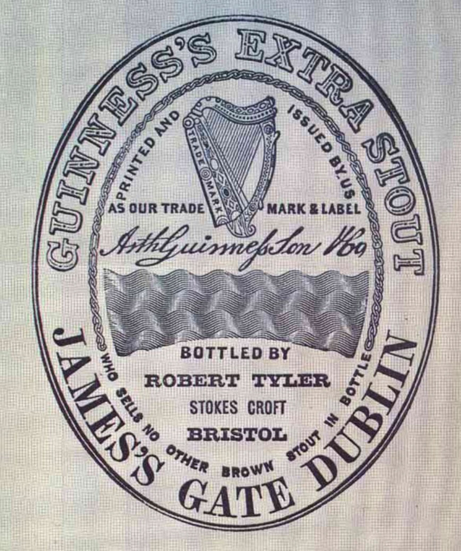
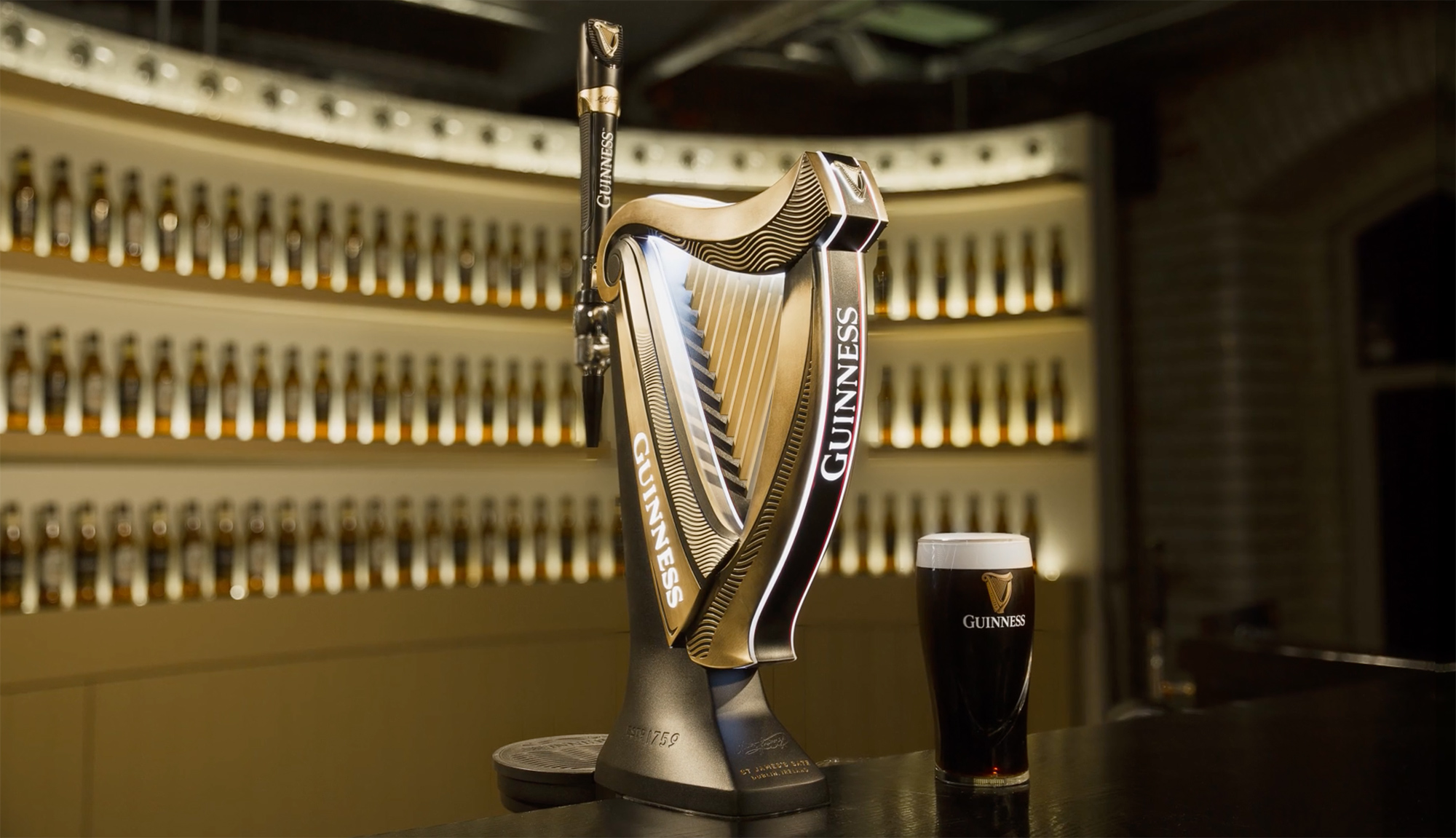
The main features of the trademark label were the harp, the Guinness name, and the Arthur Guinness signature. They evolved into the three core elements of the Guinness identity, and remain as such today.
In 1876, fourteen years after the label was introduced, Guinness registered the harp as a trademark. The design is based on a famous 14th century Irish harp known as the O’Neill, or Brian Boru harp, preserved in the library of Trinity College Dublin.
Various changes have been made since its first appearance, with the 1968 version particularly notable for the simplified appearance and a reduction in the number of strings. The most recent iteration was by London-based Design Bridge, working in collaboration with Gerry Barney — the man responsible for the Harp designs in 1968 and 2005. As an aside, Barney also designed by the iconic British Rail double-arrow logo while working at the Design Research Unit.

The harp is also the official national emblem of the Republic of Ireland, and can be found on the country’s coins and on the front of Irish passports. The difference between the Guinness harp and the Republic’s harp lies in the position of the straight edge, or sound board. The straight edge on the Guinness harp always appears on the left, while the Republic’s harp is on the right for differentiation.
The harp has reportedly been recognised as a symbol of Ireland since the 13th century. References can be read on the Wikipedia page for Ireland’s coat of arms, and Old Moore’s Almanac asks, “Did Ireland’s national symbol come from Guinness?”


Info via Guinness Storehouse, IrishCentral, and Reinhardt.edu.
Head over to Hop Culture for more on the story of Guinness and its international appeal.

