Inspiration for the Perfect Spa Logo
Home » Logo Design
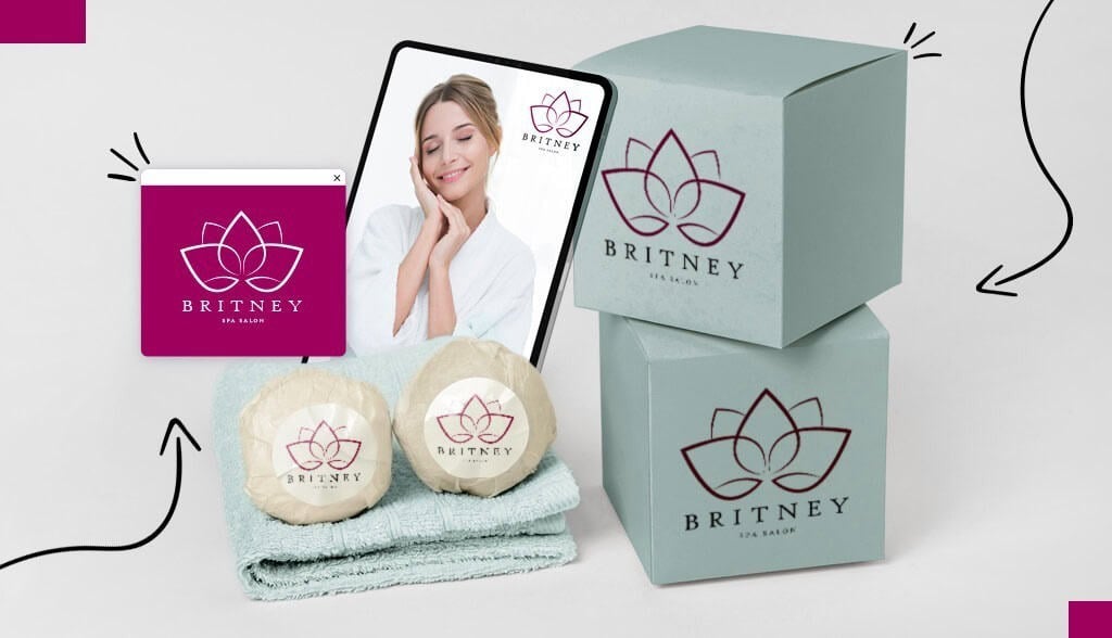
Relaxing music? Check. Scented candles? Check. Now all you need is a standout logo for your spa business. The best way to make your spa the top spot for rest and relaxation is to establish a brand that reflects your expertise, values, and brand personality.
Browse the collection of spa logos I’ve arranged below to see how others in the market are branding themselves. In addition to design inspiration, make sure to read about what colors, fonts, and symbols best suit spa logos.
Logo Design Examples by Type
Let’s take a look at different designs categorized by logo type, including how each uses colors, icons, fonts, and style.
Wordmarks


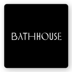
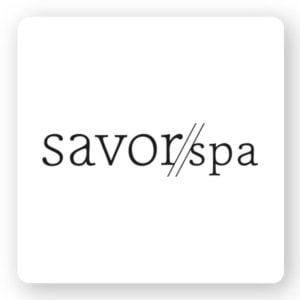
Wordmark logos are letter-based only, excluding any images, icons, or emblems. Although they’re stripped down, they aren’t boring. In fact, wordmark logos have the ability to increase brand recognition, are timeless and versatile, which is why they work so well in the spa industry.
When it comes to spa logos, you want your design to convey calm and serenity. To do so, many spas, such as Wi Spa and Zensayshen Spa, use serif fonts. Another tip is to place with the kerning, which is the process of adjusting the space between characters to achieve the desired aesthetic. Bathhouse not only plays with the font’s spacing, but they also decided to widen and narrow the letters to achieve a unique yet timeless impression.
Circles and curves
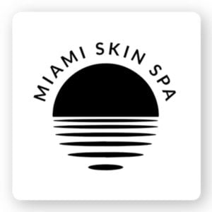
Logo shapes hold meaning with circles representing unity, completeness, and harmony, which make it perfect for a spa logo. Many things found in nature (sun, stars, moon, flowers, seeds, etc) are in the shape of a circle. Sojo Spa Club, for example, features an icon that’s in the shape of curved flower petals. The Miami Skin Spas icon looks like a setting sun with ripples on the water. Meanwhile, Yihan Spa’s logo also appears to look like a rippling body of water. All these gentle curves and circles embody the gentleness and sense of tranquility one would expect from a spa logo.
Natural elements

Natural elements symbolize groundedness, growth, and transformation, which make it perfect for a spa logo. You can either use an icon of a natural element or an abstract drawing of something found in nature.
For example, the Raven Spa used a raven icon since the bird represents rebirth and starting anew, all traits they wanted to express through their logo. And the Leela Spa went with a simple, elegant flower. However, the Spa Dew logo chose blue droplets grouped together to form a flower. Whether you decide to go with an obvious depiction of a natural element or an abstract concept, natural logos work extremely well for spas.
Oriental elements

Oriental means coming from or associated with eastern Asia, especially China and Japan, which is fitting for spa’s since these cultures are known for their emphasis on skincare and holistic wellness. For a spa logo that embodies rest and relaxation, a holistic design inspired by oriental elements is popular.
My favorite logos here are Sensation Spas clean buddha icon and earthy brown color palette and Body Sense’s yin-yang and calligraphy-style brushstrokes. Remember to balance your logo with the right font and color palette; Everything Zen is a great example of how to strike this balance.
Female silhouette

A silhouette shows the shape of the subject without any detail. For this reason, silhouettes are particularly impactful and work well as spa logo icons. There’s a lot of directions you can take this in. First, you can design an abstract logo with a hidden meaning like Upper West Spa and Medical Aesthetic’s logo. Their logo depicts an artistic rendering of a tree with white space around it creating an impression of a woman’s face.
Or you can go with a more simple silhouette design like Miami Skin Boutique and Spa and Lôk Siam Spa (note the natural elements too). Lastly, what I like about Ultra Shape Spas silhouette icon is that the woman’s back is drawn around the ‘S’ in the name. The thin lines and delicate curves make this logo elegant, soothing, and relaxing.
Over to You
When designing any logo, you should remember 3 main points:
-
Keep it simple -
Make it aesthetically pleasing -
Ensure your design captures your values and brand
I hope you’ve been inspired and learned a few things so you can go ahead and design your own spa logo. Now you’re ready to create a standout spa logo that will let clients know they’ll be in good hands.
Disclaimer
The information provided on this page is for information, educational, and/or editorial purposes only. It is not intended to indicate any affiliation between Tailor Brands and any other brand or logo identified on this page.

Top 18 Places to Find Logo Design Inspiration

How to Design a Logo For Your Freelance Business

8 Cost-Effective Marketing and Branding Strategies for Restaurants
The post Spa Logo Inspiration appeared first on Tailor Brands.


