 Pinkfong Logo PNG
Pinkfong is a South Korean educational entertainment brand, under the wing of SmartStudy, a global educational content company. The founder of SmartStudy, Kim Min-seok, sought to offer engaging and stimulating content for young learners worldwide. Pinkfong is best recognized for its digital content and song videos for children, with its most celebrated creation being the global sensation “Baby Shark”. Operating predominantly in the digital space, the brand has touched hearts in over 100 countries, making waves on platforms such as YouTube and various app stores. Their innovative approach combines music, animation, and play to make learning delightful for children.
Meaning and history
Established in South Korea by Kim Min-seok, Pinkfong is an emblematic offshoot of the SmartStudy educational content conglomerate. Since its inception, Pinkfong has championed the fusion of catchy tunes with animated visuals, aiming to offer a unique educational experience for children. The brand’s monumental success is epitomized by “Baby Shark”, a catchy children’s song that not only became a viral sensation on platforms like YouTube but also inspired dance challenges and merchandise globally. Its repertoire has expanded beyond just digital content, branching into toys, books, and even live shows. Currently, Pinkfong continues to be a household name in children’s edutainment, persistently innovating and expanding its global footprint.
What is Pinkfong?
Pinkfong is a South Korean educational entertainment brand, a subsidiary of SmartStudy. Renowned for its captivating digital content for children, its most iconic creation is the viral sensation “Baby Shark”. The brand remains a leading force in children’s edutainment globally.
2010 – 2012

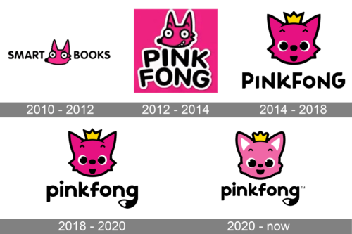
Sporting a minimalist aesthetic, the “Smart Books” logo combines playful whimsy with scholarly vibes. The dominant pink, fox-like character stands out with its sharp, triangular ears, embodying a sense of cleverness and curiosity. Its wide eyes underscore its quest for knowledge, while the simple font choice for the brand name suggests an approachable and modern reading environment. The integration of the character’s face within the typography adds an element of fun, making the brand feel inviting for all age groups.
2012 – 2014
Set against a vibrant pink backdrop, the “Pinkfong” logo bursts forth with energy and youthful zest. The animated, crowned pink fox character, with its mischievous grin, encapsulates the essence of childhood fun and adventure. Its eyes, wide with excitement, beckon viewers into a world of imagination. The bold, white typography complements the energetic mascot, rounding off a design that is both catchy and memorable, perfectly targeted toward a young audience.
2014 – 2018
Balancing simplicity with charm, the “Pinkfong” logo depicts a rosy, crowned fox that embodies innocence and wonder. The fox’s large, gleaming eyes convey a sense of awe, while its crowned head hints at tales of kingdoms and fantasies. The straightforward, bold black typography ensures clarity, with the brand’s name standing prominently below the adorable mascot. A hint of playful curvature in the lettering adds a touch of softness, aligning with the brand’s child-friendly ethos.
2018 – 2020
Merging regal elegance with playful design, the “pinkfong” logo is a delightful fusion. The pink fox, adorned with a crown, conveys tales of enchanted realms, with its gleaming eyes sparkling with stories. The lower-case typography, with its curvaceous tail on the ‘g’, adds a touch of whimsy, contrasting beautifully with the more straightforward depiction of the fox. This logo gracefully balances the childlike wonder with an elegant design sensibility.
2020 – now
The Pinkfong logo effortlessly combines the whimsy of childhood with a touch of regality, creating an emblem that speaks directly to its young audience while ensuring it remains appealing to caregivers and parents. At the center of the design stands a jubilant, pink-hued fox, its playful features beaming with a mix of innocence and mischief. The fox’s eyes, large and glistening, convey a sense of wonder and curiosity, a reminder of the countless tales of adventure and learning that Pinkfong represents.
Above the fox’s head sits a modest crown, a nod to the enchanting tales of kingdoms and fairytales that children so dearly love. This crown, while small, plays a pivotal role in the logo’s narrative, transforming an ordinary fox into a character of importance and story. It suggests that within the world of Pinkfong, every child is royalty, every story is an epic, and every song is a ballad.
The brand name “Pinkfong” is penned in a modern, approachable font, the characters flowing seamlessly, echoing the brand’s dedication to smooth, engaging storytelling. The subtle curl at the end of the letter ‘g’, coupled with the trademark symbol, is a gentle reminder of the brand’s uniqueness and authenticity in a world teeming with content. Collectively, the logo captures the essence of Pinkfong—a brand dedicated to fostering imagination, promoting learning, and ensuring that the magic of childhood remains ever-present.


