
Throughout history, art and design movements have played a significant role in shaping our world, from the Renaissance to contemporary packaging design. One example of such movements is minimalism versus maximalism, which are opposing aesthetics that have gained popularity in recent years. Whether you’re a designer, artist, business owner, or someone who appreciates visual aesthetics, you may have heard discussions about minimalism vs maximalism.
Choosing the right approach can be a challenging task. In this article, we will take a closer look at what sets them apart and discuss various packaging examples. Let’s find the style that works best for your design!
What is minimalism?
—
Minimalism is a movement that emerged in the 1960s and is rooted in the Modernist movement. It is characterized by a “less is more” approach and emphasizes simplicity, functionality, and elegance. Minimalist designs often feature a color palette of pastels and neutrals, clean lines, and simple forms, with the absence of textures.
Designers also use negative space and white space to provide breathing room for important features and make the message they are communicating easier to understand. Negative space refers to unoccupied areas of a design, whereas white space pertains to specific areas that are intentionally left blank or white. Although these spaces may seem unimportant, they create emphasis on essential elements. This emphasis helps to create a sense of balance and harmony, which is equally as important as the design elements themselves.
What is maximalism?
—
On the other hand, maxim332c7aalism is the opposite of minimalism. It arose from the postmodernist movement in the latter half of the 20th century and as a reaction to minimalism. Often called the “aesthetic of excess”, this is a movement that prioritizes bold colors, sharp patterns, and catchy textures in attention-grabbing designs. Unlike minimalism, which focuses on simplicity and understated design, maximalism embraces excess and extravagance.

Minimalism and maximalism in packaging design
—
When it comes to design, there’s often a perceived dichotomy between minimalism and maximalism. However, it’s worth considering whether these approaches are truly mutually exclusive. In fact, many designs incorporate elements of both. This is especially true in packaging design, where brands must balance conveying their identity and messaging with creating a visually appealing product that stands out on shelves. A minimalist design can be a great choice for brands looking to convey a sleek and modern image, often associated with high-end products that exude sophistication and luxury.
For example, this can be seen in Apple products and their signature matte finish that feels incredibly smooth to the touch, often with the brand name embossed on the box. Apple has successfully cultivated a connection between their products and a feeling of modernity and innovation through their minimalist design approach. The focus is on specific information, with fewer graphic elements, which creates a clean and sophisticated image that appeals to consumers who value simplicity and elegance.
On the other hand, maximalism can be an effective choice for brands looking to stand out and express energy and excitement. It usually includes bold colors, patterns and textures. A sense of vibrancy and playfulness can be created. This can be particularly appealing to younger audiences.

In the next section, we’ll examine examples of successful and innovative packaging design in both minimalism and maximalism.
Examples of minimalist and maximalist packaging
—
What’s the best way to learn about visual design?
By looking.
In this section, you’ll see a wide range of different product packaging that either leans toward minimalism or maximalism. Read on to learn how to integrate these ideas into your packaging designs!
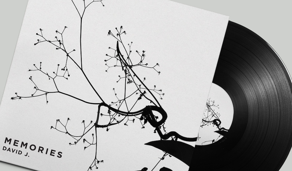
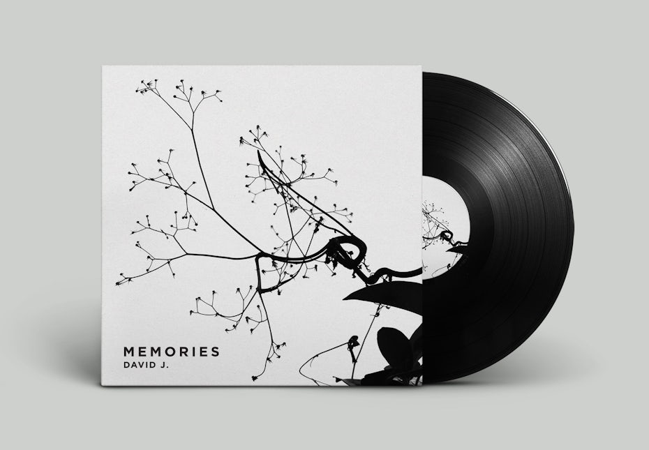
Heyhale nutrition packaging design: minimalist

Why it’s minimalist
This packaging design leans toward the minimalist side as it is focused on the bare essentials, including the logo, company name, and product name. The use of black and white with muted tones and a low-maintenance script font gives it a stylish, authentic feel without being overthought.
Why we love it
This design is a great example of how simplicity can be powerful. It aligns with the product’s vegan-friendly and natural ingredients, using earthy tones and eco-friendly materials to communicate its values. The minimalist design features the product name and a subtle representation of the ingredients, adding an organic touch. The use of plastic-free packaging enhances its eco-friendly image. Overall, the design is a great fit for a health-conscious and environmentally aware consumer.
Ting’s Jackfruit Chips packaging design: whatever you want it to be

Why it’s maximal
This design is a great example of maximalism with its use of bold typography, bright colors, and a mixture of layered elements. The asymmetrical layout creates a dynamic and visually striking composition, while the use of photographic imagery adds a sense of realism and texture to the design. The combination of 2D shapes and colors with photographic imagery gives a nod to the ’90s collage style, adding even more maximalist elements to the design.
Why this one falls under both umbrellas
It intentionally blends aspects of minimalist and maximalist design, using negative space and simple geometric shapes while also incorporating bold colors and quirky layered elements for a contemporary and unique result.
Why we love it
We love this packaging because of its playful composition and bold colors. It gives an “ordered chaos” to the design, making it more memorable. The resealable bag adds a practical element and the photo draws your attention to what’s important—the product itself.
Xook packaging design: minimalist

Why it’s minimal
It’s hard to argue that this packaging design takes anything other than the minimalist approach. On the two most prominent surfaces, we see the company logo, name and product type. The overall composition is uncluttered. There is the use of negative space and clean typography. The use of a single font and color scheme further reinforces this minimalistic approach.
Additionally, the inclusion of a handle that is integrated into the lid cutout adds a playful touch. It teases the rebellious personality of the brand, while still maintaining the overall minimalist aesthetic.
Why we love it
The Xook kiosk offers fresh, made-to-order salads and bowls with precision and consistency. The packaging design reflects the brand’s commitment to straightforward, user-friendly service with its clear and simple design. Additionally, the use of eco-friendly materials aligns with the brand’s sustainability values.
Little Danube packaging design: minimalist
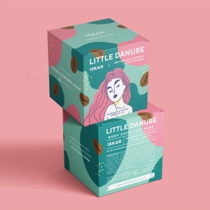
Why it’s minimalist
This packaging design seems to be minimalist with its limited color palette. The use of negative space creates a clean and uncluttered composition. It also uses simple geometric shapes and the lack of depth in the illustration style also contributes to the minimalist feel.
However, the designers have managed to make it fun and playful by adding balance and space to breathe around each element. Despite the high number of individual features, the design remains uncluttered and easy on the eyes.
Why we love it
We love this packaging because of its meaningful, soft colors and illustrations. It reflects the story of the founder, Katrina’s journey from east to west of Europe, where each bar of soap carries a wonderful scent that resonates with a memory and place.
Ayurvedic Hand made soap packaging design: maximalist

Why it’s maximalist
As seen in this design, the bright colors and intricate patterns achieve a maximalist look. The floral and geometric motifs emphasize this style. The use of earthy tones and botanical illustrations creates a visual connection with the natural ingredients used in the soap, which influences the viewer to believe in the quality of the product inside.
This design incorporates a variety of elements that create an overall sense of abundance and richness, which is not typical of minimalist design.
Why we love it
The tonal oranges and spacious layout make it rather easy on the eyes, while the intricate patterns add depth and interest. Despite the complexity of the design, it doesn’t overwhelm the senses and maintains a sense of coherence and balance.
Cape Coast Co packaging design: minimalist

Why this one falls under both umbrellas
While this packaging design may fall under the category of minimalism, it’s far from ordinary. Its unconventional alignment of text, layering, and incorporation of sticker art give it a Brutalist influence. The limited color palette of only three colors and simple typography may seem minimalistic, but the combination creates a sense of chaos and complexity.
Why we love it
The fact that it’s simple and to the point makes this design delightfully minimalist. The design also goes beyond the essentials of a logo and product description, showcasing how minimalist elements can be used in unexpected ways.
Granola Barks packaging design: minimalist

Why it’s minimal
While the design does incorporate a limited color palette, it also features several elements that prioritize the brand’s values and target audience. These include brand keywords, photos of the product and its intended users, and a clear message about the product’s benefits. The finished result is a blend of minimalist and informative design, rather than a strictly minimalist approach.
Why we love it
This packaging design is striking in its simplicity, with a clear focus on the essentials. The use of a single color on the background and foil highlights the key elements of the design, including a photo of a rescue dog and the product name. The brand and product is communicated effortlessly to the audience—plus it’s packed with personality.
Pine State Coffee packaging design: maximalist

Why it’s maximal
Complex patterns, bright contrasting colors and detailed text, this packaging for Pine State Coffee is a maximalist design. Even the intricate illustrations suggest attention to detail that’s typical of maximalism. However, the use of minimal designs on the sides of the pack balances out the intricacy of the front and back, making the overall design feel harmonious and well-considered.
Why we love it
This packaging design perfectly echoes the branding as well as the product design itself—bright, fun, vibrant and welcoming. It incorporates the colors of the sunset, nature-themed illustrations and the product’s natural ingredients. Speaking of which, focusing on the product’s core component, coffee beans, is exactly what this packaging design does.
Choosing the right style for your packaging design
—
Minimalism or maximalism—which is right for you? More importantly, which style suits your brand, your product or your business?
Remember, there are no clear dividing lines of what these two themes are and are not. If you prefer to use bright vibrant colors alongside a simple handwritten font, do it. Design rules are always meant to be broken! It’s up to you to figure out what works best for the application you need. And the best way to find an answer to the minimalism vs maximalism question? Just get out there, get to know your own style and customers. Then play around with design styles until you find one that perfectly represents your brand!
Want to get a unique packaging for your brand?
Our designers can create something marvellous for you.
This article was originally written by a guest blogger and published in 2018. It has been updated with new examples and information.

