 Hypebeast Logo PNG
Hypebeast is a digital platform and lifestyle brand founded by Kevin Ma in Hong Kong. It emerged to spotlight high-end fashion, streetwear, and sneaker culture, blending trends with contemporary lifestyle content. Originally a sneaker blog, it has evolved into a global community for fashion enthusiasts and culture influencers, offering news, editorial content, and collaborations. Hypebeast stands at the crossroads of fashion, art, music, and design, catering to a discerning audience passionate about the latest in creative culture.
Meaning and history

In 2005, nestled within the vibrant cityscape of Hong Kong, Kevin Ma launched Hypebeast as a humble blog aimed at sharing his fascination with sneakers. What started as a personal project quickly burgeoned into a pivotal cultural hub, transcending its original focus to encompass a wider array of lifestyle domains including high fashion, streetwear, art, and music. As it grew, Hypebeast became synonymous with the pulse of youth culture, setting trends and spotlighting underground scenes alongside mainstream phenomena.
This evolution propelled it from blog to brand, leading to the creation of Hypebeast Limited, a publicly listed entity on the Hong Kong Stock Exchange. The platform’s influence is now felt worldwide, offering not just news but also a curated selection of products and collaborations that resonate with a global community eager for the cutting edge of culture.
Through its journey, Hypebeast has remained at the forefront of style, creativity, and innovation, shaping and reflecting the dynamics of contemporary culture.
What is Hypebeast?
Hypebeast stands as a digital beacon within the world of contemporary fashion and lifestyle, born from Kevin Ma’s vision in 2005, Hong Kong. It’s a vibrant ecosystem where the pulse of streetwear, high fashion, and culture converge, offering a curated lens through which aficionados and the style-curious explore the forefront of trendsetting movements and creative expressions.
2005 – 2006

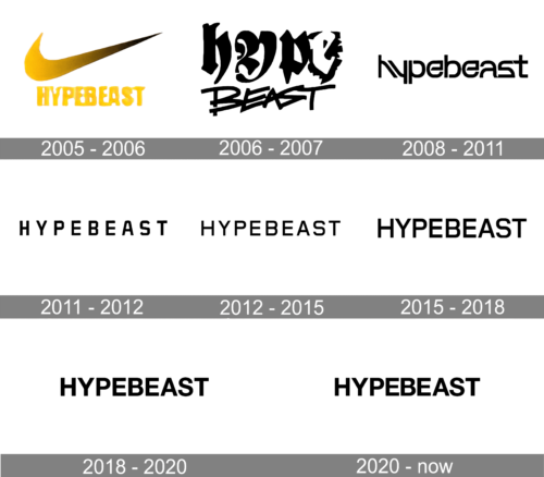
The logo portrays a bold, golden swoosh, sharply rising to the right, embodying dynamism and forward motion. Beneath it, “HYPEBEAST” is rendered in a dripping font, reminiscent of paint or molten metal, suggesting both a state of flux and the raw, unrefined energy of street culture. The color choice is a stark, sunny hue, standing out with vibrancy and confidence.
2006 – 2007

In this design, the moniker “Hypebeast” is artistically bisected across two distinct rows. The upper segment boasts an avant-garde flair: expansive, indistinct characters adorned with ornate, swirling motifs that evoke the raw, expressive nature of graffiti art. In a striking juxtaposition, the letter “e” emerges as a white void, carved out from within a dense black form. Transitioning to the word “BEAST”, a starkly contrasting graffiti-inspired font takes the stage. These characters lean aggressively to the left, their contours jagged and sharp, as though cutting through space. This dynamic angulation infuses the design with a palpable sense of motion. The aesthetic choice mirrors the essence of urban culture—celebrating creativity, vibrancy, and the unique spirit that defines streetwear fashion.
2008 – 2011

The logo is a stylized text-based design, featuring a bold, black-colored font. The text is arranged in a single line, with the distinctive feature being that parts of each letter are exaggeratedly elongated, notably the horizontal lines. This elongation of the letters gives the logo an edgy and contemporary vibe. The letters are connected, suggesting a sense of cohesion and trendiness. There’s a sense of movement within the typography that evokes a dynamic and youthful energy, aligning with current urban styles.
2011 – 2012

In this iteration of the logo, the text adopts a uniform, block-style font without any of the previous elongation or distortion. The letters are evenly spaced and aligned, conveying a sense of balance and formality. The design is minimalist, with a focus on clarity and readability. The font’s weight is consistent, suggesting strength and stability. This logo’s simplicity makes it versatile for various applications, indicating a more mature brand identity. The black color remains, retaining the logo’s bold and assertive character.
2012 – 2015

The logo displayed is identical to the one previously discussed, maintaining its minimalist and balanced design. It continues to feature a bold, black, sans-serif font where each letter is of uniform size and weight. The text is precisely aligned, promoting a clean and modern aesthetic that speaks to a straightforward and refined brand identity. No changes are apparent between this version and the one provided earlier, suggesting consistency in the brand’s visual representation during this period.
2015 – 2018

The image contains the same logo as before; there are no discernible changes to the design. The text remains in a stark, bold, sans-serif typeface with each letter uniformly sized and spaced. The consistency of the font weight and the arrangement maintains a minimalist and professional look. The black color of the font continues to give the logo a strong and assertive presence. Overall, the logo’s repetition indicates a steady brand identity over the years, aiming for recognition and memorability in its simplicity and consistency.
2018 – 2020

The logo in this image appears unchanged from the prior versions provided. It continues to showcase the same bold, sans-serif typeface, with uniform and evenly spaced letters. The stark black color is consistent, maintaining the logo’s authoritative and modern appeal. There is a clear commitment to a clean and simplistic design ethos, reflecting the brand’s preference for a timeless and adaptable visual identity. The repetition of the logo over various iterations indicates a strong brand consistency.
2020 – Today

Upon review, the logo remains consistent with the previous submissions. It displays the word “HYPEBEAST” in a bold, sans-serif typeface, uniformly executed in solid black color. The design has undergone almost no changes, which indicates a conscious choice aimed at maintaining the continuity of the brand. The simplicity and starkness of the design emphasize a modern and clean aesthetic that appears to be a permanent fixture of the brand’s identity.


