 Dutch Bros Logo PNG
Dutch Bros is a renowned drive-thru coffee chain, founded by brothers Dane and Travis Boersma in Grants Pass, Oregon. Originating from a single espresso pushcart, it was created to offer high-quality, handcrafted beverages with a unique, friendly customer experience. Emphasizing a vibrant, community-oriented culture, Dutch Bros quickly expanded, becoming a beloved coffee destination known for its diverse drink menu and lively, engaging service.
Meaning and history
Dutch Bros Coffee, established in 1992. They started humbly with a single pushcart, serving espresso to locals. Their vision was simple yet profound: to serve exceptional coffee while fostering community connections. This concept rapidly gained traction. The business expanded, emphasizing not just quality beverages but an unforgettable, energetic service experience. Known for its varied menu, including exclusive coffee blends and specialty drinks, Dutch Bros evolved into a cultural phenomenon. Its unique combination of quality, speed, and charismatic service propelled it into a leading position in the drive-thru coffee sector.
Dutch Bros stands as a testament to entrepreneurial spirit and community-centric values.
What is Dutch Bros?
Dutch Bros is a dynamic drive-thru coffee chain, renowned for its spirited and engaging barista-customer interactions. Established by the Boersma brothers in Oregon, it blends a passion for quality coffee with a commitment to community, offering a diverse menu in a uniquely energetic atmosphere.
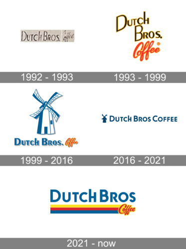
1992 – 1993
The Dutch Bros logo exudes a casual, hand-drawn charm, capturing the essence of the brand’s laid-back, yet energetic vibe. Scripted in a freehand style, the words “Dutch Bros” are penned in what appears to be a personal, whimsical manner, suggesting a sense of warmth and approachability. The addition of “Coffee” in a smaller, understated script beneath reinforces the brand’s core offering without overpowering the primary name. This logo conveys a sense of individuality and friendliness, consistent with the company’s community-centric ethos.
1993 – 1999
Transitioning from the previous version, this Dutch Bros logo evolves into a more stylized and vibrant design. The “Dutch Bros” text adopts a bolder, outlined font, showing off a stronger and more assertive brand presence. Below, “Coffee” is now in a flowing, energetic script in a standout red shade, reflecting the brand’s dynamic approach to coffee culture. The overall effect is a more modern, attention-grabbing logo that mirrors the company’s growth and energy.
1999 – 2016
This iteration of the Dutch Bros logo introduces a windmill graphic, a nod to Dutch heritage, adding a visual anchor. The typeface for “Dutch Bros” is more refined and uniform, enhancing legibility and professionalism. “Coffee” remains in its cursive, dynamic form but is now cradled by the windmill’s base, integrating the elements into a cohesive unit. This design shift signals a blend of tradition with the brand’s energetic personality.
2016 – 2021
In this logo, Dutch Bros adopts a minimalist aesthetic, discarding the windmill’s details for a simplified icon. The text “Dutch Bros Coffee” transitions to a modern, uniform font, echoing contemporary design trends. The color palette is streamlined to a single shade of blue, symbolizing a more mature, refined brand identity. Overall, this logo reflects a shift towards minimalism and efficiency in brand representation.
2021 – Today
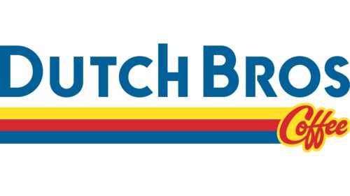
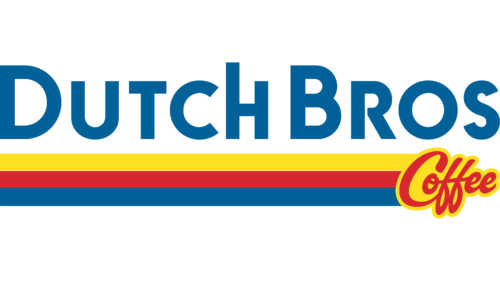
Reverting to a more colorful palette, this Dutch Bros logo reintroduces a vibrant stripe, adding a playful character. The “Coffee” script is now in a lively yellow, infused with energy and warmth. The typography of “Dutch Bros” maintains its simplicity, but the added colors reflect the brand’s fun and inviting nature, echoing its commitment to a cheerful, community-driven experience.


