

Pride was always meant to be seen. Prior to 1969, any publicly identified LGBTQ+ person could be subject to harassment and threats of violence by police, even when they gathered in private.
On June 28, an NYC police raid on the Stonewall Inn gay bar—one of the few havens for a group already pushed to the margins of society—sparked a massive riot. Over two days, the patrons marched in the streets, demanding not only the right to share a drink in peace and quiet, but to be seen for the human beings they are. This watershed event was the birth of LGBTQ+ Pride celebration, which commemorates the rioters’ brave actions through annual parades and demonstrations. Now 54 years later, LGBTQ+ Pride is seen around the world every June.
Not only did the first Pride spawn an international liberation movement, it has contributed to the enduring visual culture that unifies LGBTQ+ people. This has included recognizable symbols as well as the rainbow colors of the Pride flag. Of course, queer art has existed long before the Stonewall riots. Back when laws criminalized homosexuality and medical institutions pathologized gender nonconformance, speaking openly about LGBTQ+ subjects meant risking your livelihood, if not your life. Visual art, therefore, became the prime vehicle for rendering, navigating, and expressing the complexity of queer identity without words.
Whether it’s Frida Kahlo’s surreal exploration of identity through self-portraiture or Keith Haring’s joyful and accessible illustrations, queer artists redefined the creative landscape through imagination born from experience. Even when their work did not explicitly express LGBTQ+ subject matter, it showed their humanity in times when queer people were dehumanized. Beauford Delaney created vibrant music out of color, Robert Rauchenberg challenged the dominant school of art through Neo-Dadaism, Andy Warhol reexamined the idolizing gaze of commercialism, Erté defined a new standard of glamor, and Jean-Michel Basquiat rendered intersectionality through mixed media.
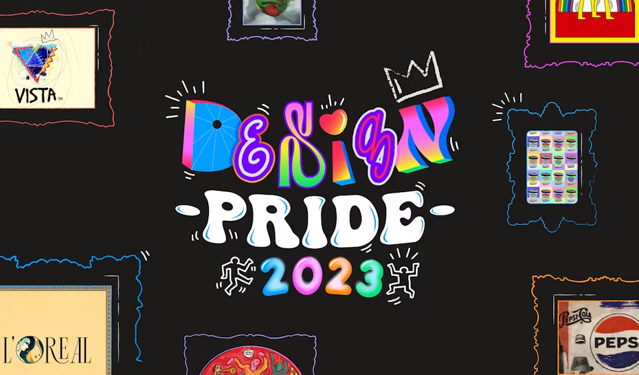
All of these artists have left their mark on the generation of queer creatives that followed them, to the point LGBTQ+ imagery has broken through to the mainstream—from rainbow crosswalks to drag queens on TV. The logo designers at 99designs by Vista have likewise been inspired by the legacy of queer art, and for this year’s Pride, we challenged our community to channel that inspiration into reimagining the logos of LGBTQ+ inclusive brands.
Learn more about the style of iconic LGBTQIA+ artists by watching the video below or reading the rest of the article. Either way, you’ll be inspired by these amazing artist and their work.
Famous logos reimagined in the style of iconic LGBTQIA+ artists
—
The merging of art and the commercial sphere can be a powerful thing. Because corporations have their own visual branding language that is advertised to the masses, their imagery is broadly recognizable—a useful trait for artistic purposes. Historically, redefining corporate branding has allowed artists to communicate entirely new messages to mass audiences, as exemplified in the work of Pop Artists. Along these same lines, the 99designs by Vista creative community has reimagined seven company logos inspired by the style of seven iconic queer artists over the last century.

Each one of the companies chosen earned a 100% rating on the Human Rights Campaign’s (HRC) Corporate Equality Index, making the 2022 list of “Best Place to Work for LGBTQ+ Equality.” These are businesses that have thoroughly demonstrated the power of corporate allyship, not only through equitable hiring but by supporting their LGBTQ+ employees through company policies and culture. Specifically, the HRC evaluated how well each of these brands performed on outlining nondiscrimination protections, providing full same-sex and transgender healthcare coverage, facilitating employee training on LGBTQ+ issues, sponsoring internal advocacy organizations, and supporting the wider LGBTQ+ community. In other words, these are brands that go above and beyond in leveraging their resources for LGBTQ+ rights.
The logo designers at 99designs wanted to recognize the work these brands do while paying homage to some of the most influential queer artists in history. Their work is a celebration of how far LGBTQ+ inclusivity has progressed over the years, right into the everyday workplace.
We’ll examine the legacy of each artist before revealing how a modern designer reimagined their style. It is important to note that the artists we’ll look at here are complex cultural icons on whom whole books have been written—for our purposes, we’ll focus on their major works briefly in the context of their queer identity. If you discover a new favorite artist in the list below, we encourage you to look up even more details on their life and work!
Frida Kahlo
—
The artist
Having painted nearly sixty self-portraits throughout her lifetime, Frida Kahlo made art out of depicting the many facets of identity. Her 1940 work Self-Portrait with Cropped Hair explores gender fluidity, showing the artist in a suit with her hair cut to masculine shortness, the shorn strands discarded around her. The chaos of the scattered hair, like a decimated battlefield, stands in contrast to the serenity of Kahlo’s seated pose.
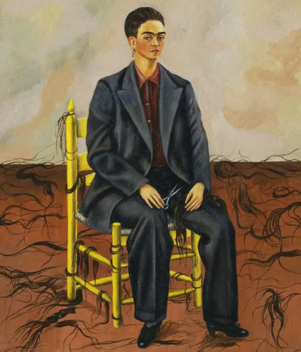
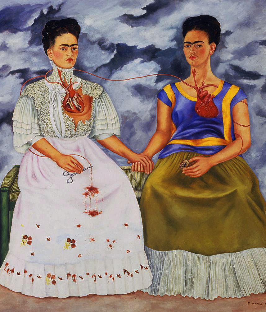
Hair and clothing were powerful symbols throughout her oeuvre, as she depicted herself in both indigenous Tehuana or Europeanized dresses, with her hair sometimes up, sometimes “unbound.” Each subtle change of her external appearance is made all the more potent through the sheer volume of her self-portraits, inviting us to ask which elements make up the real Frida, if there is such a thing. In addition, Kahlo would frequently delve beyond the external to render her anatomy, as in 1939’s The Two Fridas, exposing the messy bits of herself that remain hidden. Although she is classified as a surrealist, and much of her work does feature dreamlike imagery, the emotive power of her self-portraits is so human that even the strangest of her imagery rings true.
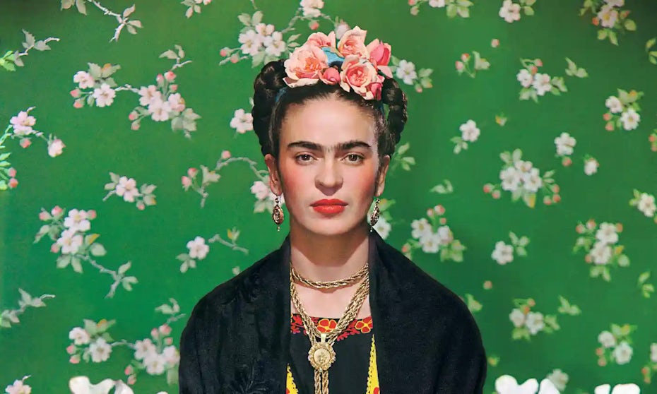
When it comes to Kahlo’s personal life, her marriage to the (at-the-time) more famous painter Diego Rivera tends to get the most attention, given how fraught it was. But she and her husband had several extramarital relationships, with Frida seducing both men and women (many of them her own husband’s mistresses). The homophobia of the time meant that many of her queer relationships have been relegated to rumors (among them fellow painter Georgia O’Keefe and actress Dolores del Río, who is believed to be the subject of 1939’s Two Nudes in a Forest). But she was open enough about her sexuality that her own husband described her as “a homosexual.” In both her life and artistic work, Kahlo proudly displayed the intrinsic value of gender and romantic identity.
Reimagining Spotify’s logo in Frida Kahlo’s style
In addition to top marks on the HRC’s Corporate Equality Index, Spotify supports its LGBTQ+ workers through the employee resource group (ERG) Spectrum. In 2019, Spectrum initiated a company-wide campaign to advance the coverage of gender-affirming healthcare, bringing the company up-to-date with standards set by the World Professional Association of Transgender Health. More recently, this year, Spotify has launched the GLOW campaign to create a year-round hub and playlist highlighting LGBTQ+ musicians while providing songwriting workshops and donations to charity organizations.

For designer Byangejimenez, a fitting analogy for the healing power of music was Frida Kahlo’s transformation of her own inner pain into resonant self-portraits. Their Kahlo inspired reinterpretation of the Spotify logo exposes the brand’s anatomical heart against the backdrop of a stormy sky, evoking the rhythmic cardiac beat at the heart of music.
Beauford Delaney
—
The artist
From the very beginning, Beauford Delaney straddled two worlds. He was born in Tennessee to a mother who had been formerly enslaved and a father who was a successful business owner. In Knoxville, he was trained as a classical painter, and in the late 1920s, he moved to New York City to participate in the burgeoning Harlem Renaissance. He found his way into the circles of soon-to-be influential artists and writers—including his lifelong friend and mentee, James Baldwin—many of whom would become the subjects of his later paintings.
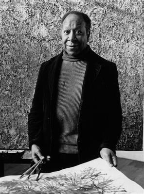
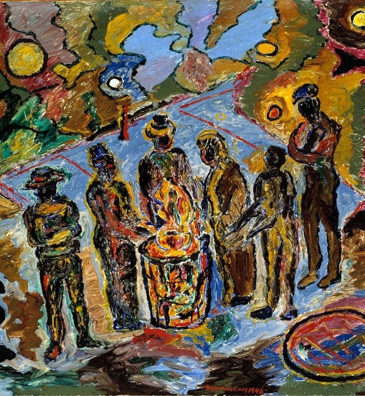
The creative melting pot of this scene inspired him to shift away from traditional painting, and he became an early forerunner of Abstract Expressionism. But while this movement was all about eliminating figures in favor of abstract color, Delaney never abandoned subject matter completely. In many of his most famous works, such as 1946’s Can Fire in the Park, he synergized abstraction with representational art, activating his depictions of real people with vibrant forms inspired by the wild rhythms of jazz. In this way, he imbued marginalized humanity with life on the canvas—through colors that seem to crackle with electricity.
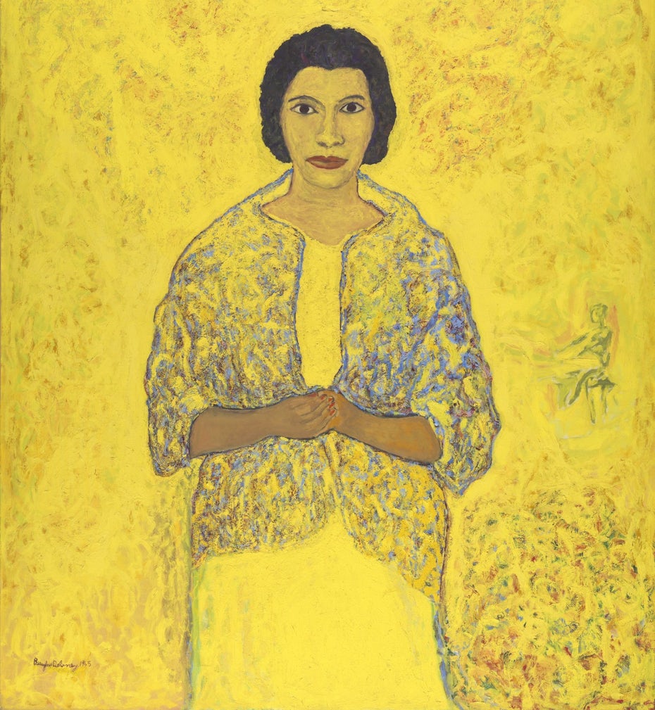
While New York provided an escape from the segregationist South, Delaney was a gay Black man, and that meant facing the double prejudices of racism and homophobia. He did connect with a thriving (if mostly white) gay community in Greenwich Village, but fear of rejection led him to keep much of his private life private. By the end of his life, this separation of his racial and romantic identity would take a tremendous toll on his mental health. In the 1950s, he left the US for Paris. Here, he produced some of his most enduring work, such as the fully abstract Composition 16 (1954-56) and his 1965 portrait of the famous Black contralto Marian Anderson. Delaney renders Anderson in the style of early Christian artistic representations of the Virgin Mary, replacing the typical gold background with writhing yellow.
Reimaging Coca-Cola’s logo in Beauford Delaney’s style
Since 2006, Coca-Cola has consistently earned a perfect score on the HRC’s Corporate Equality Index every year. One of the largest and most influential brands in the world, the Coca-Cola corporation supports the broader LGBTQ+ through partnerships with nonprofit organizations like The Trevor Project (which advocates for suicide prevention) and the Victory Fund (which supports queer political campaigns).
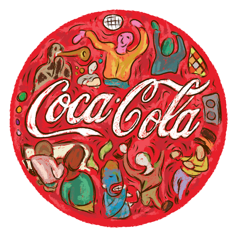
Designer Glerm Rubini’s reinterpretation of the Coca-Cola logo highlights this spirit of inclusion through a medley of abstracted figures in dynamic poses. The recognizable red itself becomes an expression of joy through Delaney’s textured and free-flowing approach to color. “All the joy and rhythm in his art themes represents well the party spirit of the brand,” explained Glerm Rubini. The end result is a logo as full of music and movement as the jazz players that inspired Beauford Delaney.
Keith Haring
—
The artist
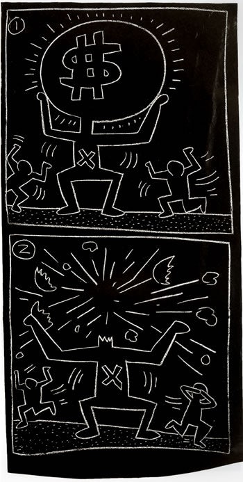
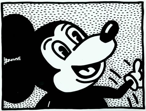
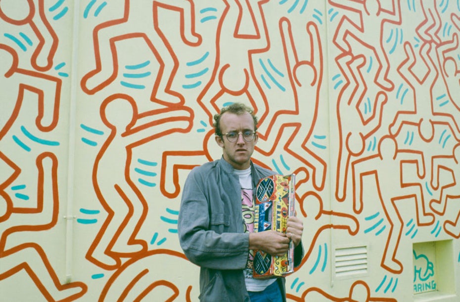
Despite exhibiting in some of the most prestigious art galleries in the world, Keith Haring always made art for the common people. Often, this meant commandeering both public and commercial spaces. Early on in his career, Haring noticed that posters throughout the NYC subway system would be replaced with a black cover after the advertiser’s lease ran out. He created chalk artwork on top of these, developing his signature style of simplified line art, energetic forms and repeated characters by working quickly to avoid arrest.
Even as he tailored these images for a general audience that included children, his work in this early period still managed to criticize the systems of power, as in the 1984 chalk drawing shown here. After a well-received showing in the Soho gallery in 1982, Haring became both a popular and critical star. But in 1986, he opened his Pop Shop to keep his art affordable for everyone.
Being an openly gay artist from the very start of his career, Haring was always willing to forge his own path. “Even [with] the subway drawings I didn’t go through any of the ‘proper channels’ and succeeded in going directly to the public and finding my own audience…I bypassed [critics] and found my public without them,” he once reflected.
His work regularly celebrated gay sexuality, rendering it not as something lurid but as bright and colorful. In the onset of the AIDS crisis, the popularity of his art made it the perfect vehicle for important messaging on safe sex practices and criticism against government inaction. It never bothered him that much of his work was impermeable—what was important was to reach people. In so doing, Haring did manage to achieve permanency in art.
Reimagining McDonald’s logo in Keith Haring’s style
In addition to nondiscrimination protections and healthcare benefits, McDonald’s has established a dedicated queer and trans-led healthcare support team for employees. The brand also prioritizes partnering with suppliers who are owned and operated by LGBTQ+ people. As one of the biggest companies in the world, McDonald’s is also a regular sponsor of queer media, including the annual variety special House of Pride on queer streaming network Revry, and LGBTQ+ awards like the Queerties and the Out100.
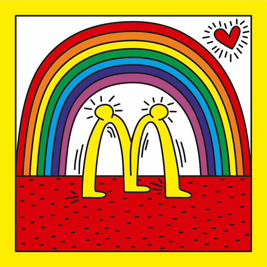
Through designer Sebas G. grupooma’s Haring-inspired logo, the world-famous Golden Arches become a pair of linked lovers, embracing beneath the echoing arch of a rainbow. The red and yellow brand colors become a bold frame, surrounding the central image in ecstatic tones. For Sebas G. grupooma, the accessibility of Haring’s art is its most inspiring feature. “What inspires me the most about his art is that it was dedicated and created for the general public—it was not intended for commercial graphic purposes,” said Sebas G. grupooma.
Andy Warhol
—
The artist
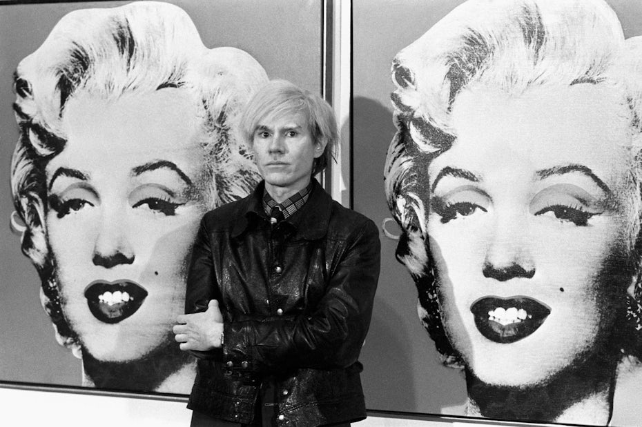
Andy Warhol is the rare artist—rare for both queer and non-queer artists—to have risen to the level of household name. His artworks reinterpreted pop culture so successfully that they have become pop cultural icons themselves. In fact, Warhol was one of the first to see the artistic value of pop culture—fusing commercial materials and fine art sensibilities into the Pop Art movement.
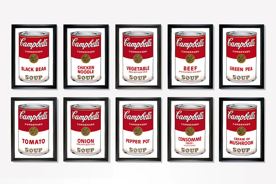
With his reproductions of Campbell’s soup labels and Coca Cola ads, he put corporate branding in the gallery context, elevating the mundane to the symbolic. This simple act refocused attention on the commercial object, asking us to interrogate what these everyday images really mean. Similarly, his reproductions of photographs of the rich and famous, from Elvis Presley to Marylin Monroe, recolored these familiar faces with unnatural silkscreen colors, exposing the inherent artificiality of celebrity.
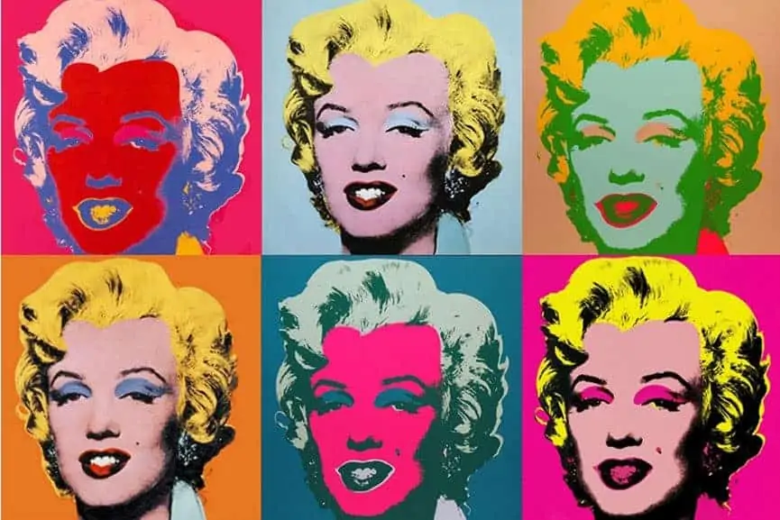
Like many queer artists, Warhol looked at things differently because he had to. While the world of the 1960s took the heteronormative experience as universal, Warhol’s own life as a queer man revealed how artificially constructed mainstream culture really is, and that idea pervades his work. Much of his art also explored gay sexuality directly, to the point that some of his male nudes were rejected from gallery exhibition for that very reason. But art critics have also noted a general streak of voyeurism throughout his work. Warhol was interested in the gaze itself, what imagery we idolize and what we take for granted as ordinary. His recreations of the familiar force us to confront our own gaze and its power to elevate or filter out what it sees.
Reimagining Ben & Jerry’s logo in Andy Warhol’s style
Ben & Jerry’s maintains a proud culture of championing progressive causes at the forefront of their business, with an activism hub right on their website. The brand has participated in a number of campaigns for LGBTQ+ rights, as in 2017 when the company stopped serving two scoops of the same ice cream flavor in protest of the Australian government’s failure to legalize same-sex marriage. More recently, Ben & Jerry’s has partnered with the National Center for Transgender Equality for a billboard campaign in support of trans youth that have been targeted by over 400 anti-LGBQ+ bills in the US.
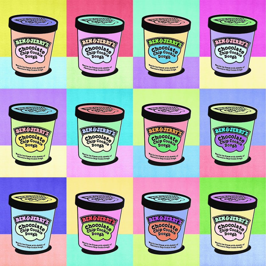
Using Andy Warhol’s Campbell’s Soup Cans as inspiration, designer Replika_ transformed the many Ben & Jerry flavors into works of art. Replika_ combined this with Warhol’s silkscreen colors, creating an unpredictable array of light pastels, a soothing rainbow. “[Warhol] was a brave individual who examined reality of the time he lived in, ruthlessly disobeyed rules and given theories…,” says Replika_. “His attempt to de-romanticize the Artist as such is a philosophy I deeply bow down to.”
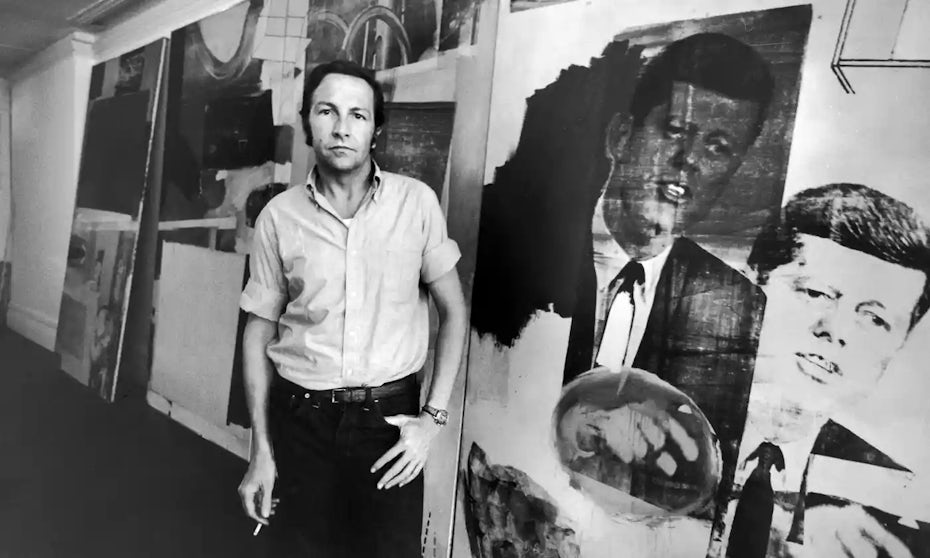
Robert Rauschenberg
—
The artist
Robert Rauschenberg’s composite artwork was defined by its difficulty to define. Emerging at the height of Abstract Expressionism in the late 50s, Robert Rauschenberg chafed against this dominant movement.
At the same time, he frequently appropriated the style for his own purposes. Abstract Expressionism celebrated the medium of art by focusing solely on the paint itself, forsaking subject matter altogether. Rauschenberg’s work put subject matter back into painting—even if it wasn’t always apparent what it actually was—and merged it with abstract splashes of paint. His use of magazine images and “cultural debris” predicted the 1960s Pop Art movement while his incorporation of crude found objects harkened back to the 1920s Dada movement (he is often categorized as a Neo-Dadaist).
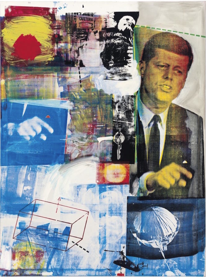
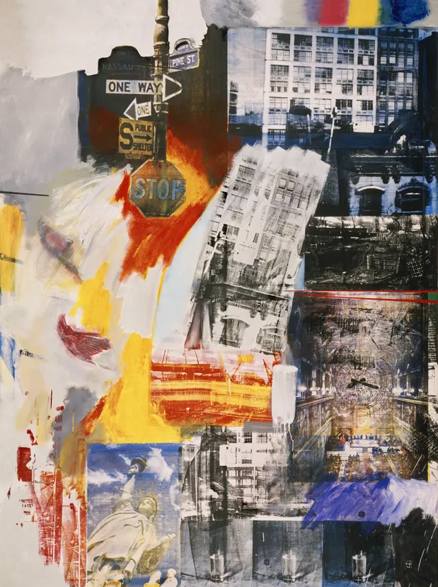
As a gay man living through the McCarthy era (in which the US government aggressively exposed and expunged LGBTQ+ people from public life), Rauschenberg had ample reason to confront conformity, even in the art world. While Abstract Expressionism started as a brave rejection of traditional painting, it had devolved into navel gazing by this point, glorifying the (usually male) artist and the masculine power of his brush. Rauschenberg retained the individualism of energetic brushstrokes, but he also incorporated ordinary media not made by his own hand, often blurring the line between painting and sculpture (his “combines”). In this way, he made the case for the very idea that you cannot separate the artist from the context of the world around them.
Reimagining Pepsi’s logo in Robert Rauschenberg’s style
PepsiCo, the parent company of the Pepsi brand, supports its LGBTQ+ workforce through the ERGs Equal and the Gender Diversity Taskforce, and the brand also hosts the anonymous support line, TransConnect. In 2016, PepsiCo became an inaugural member of the Business Coalition for the Equality Act, which supports federal US law that would solidify protections for LGBTQ+ people.

Designer Eppeler’s Rauschenberg-inspired Pepsi logo is a visual collage of the company’s branding history, with a classic logo version and bottle design paired with a hand-crafted modern logo. Eppeler was inspired by the challenge of recreating Rauschenberg’s analogue style in a digital format, and the result is a design that brings Pepsi’s branding into the tangible world. Speaking on Rauschenberg’s artistry, Eppeler says, “Mixing different materials and generating something with new meaning from existing elements I find inspiring.”
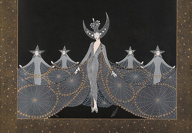
Erté
—
The artist
Erté was an artist in the broadest sense of the term. Throughout the 1920s and 30s, he designed fashion and theatrical costumes, over 200 magazine covers for Harper’s Bazaar, jewelry, textiles, interiors and silent film sets—all in addition to painting, illustration and sculpture. Whatever the medium, Erté’s work was characterized by free-flowing lines, delicately elongated forms, and abstract decorative patterns. In fashion, he created a new mode of opulence by draping women in furs and voluminous feathers and radiant jewel studding, as seen in his most often reproduced image, Symphony in Black. He left his mark on so many artistic disciplines that he came to father an entire stylistic movement: Art Deco.
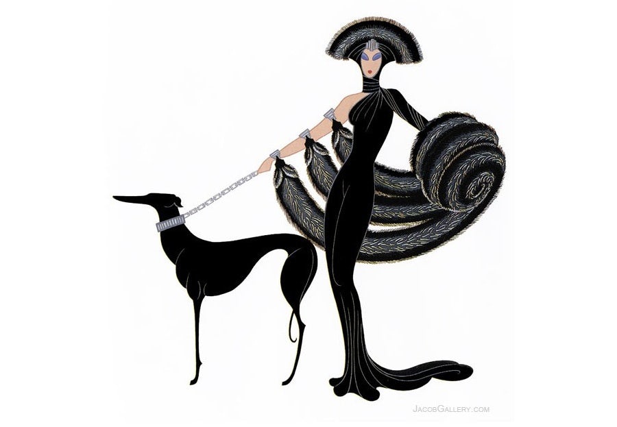
From an early age, Erté had to demonstrate tremendous courage in order to pursue the life he wanted. His aristocratic father expected him to follow his footsteps with a respectable career in the military. Erté’s decision to move from Russia to Paris and become an artist was the source of so much disgrace that he had to change his name (from Romain de Tirtoff to the French pronunciation of the initials RT). In 1925, he moved to Hollywood with his longtime partner, the Russian Prince Nicolas Ouroussoff, and the couple were able to live somewhat openly together among the other queer artists who had flocked to the film industry. His work over this period speaks to this renewed sense of freedom, through fashion that is not afraid to draw attention to itself. Erté imagined a world in which glamor reigned supreme, where the clothing on the outside is as stunning as the person inside.
Reimagining L’Oréal’s logo in Erté’s style
As a beauty brand, L’Oréal has built a business on giving customers the tools they need to express themselves, and through employee network OUT@L’Oréal, they play an active role in supporting their LGBTQ+ workforce. The brand also sponsors the onePULSE Foundation, which grants scholarships each year to honor the 49 victims of the 2016 Pulse nightclub attack.
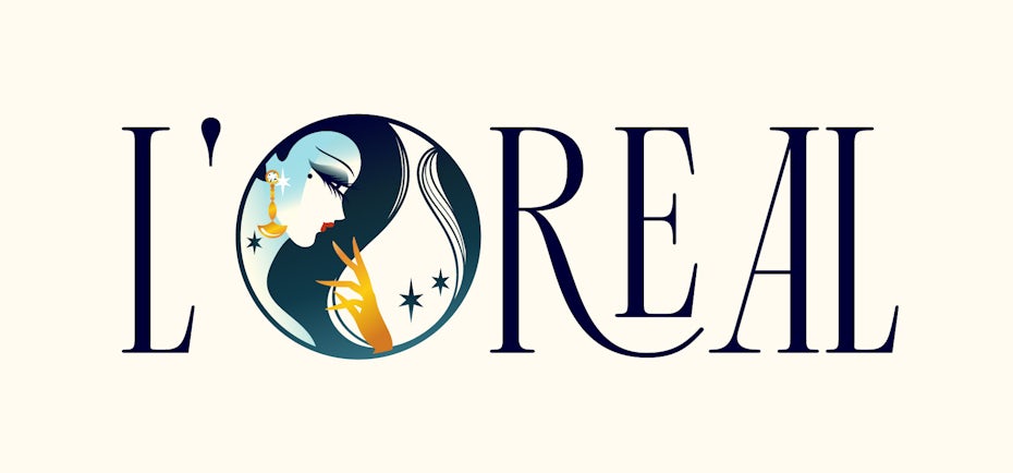
AnaMarie.Design captures the sophisticated style of Erté’s work perfectly in a classic logo design for L’Oréal. The tall Art Deco fonts mimic Erté’s lengthy figures, and the enigmatic silhouette of a glamorous lady literally sparkles within the lettering. Like Erté himself, this is a design that sees opulence as self-expression and escape from the ordinary. “For me the way [Erté’] captures the Art Deco period is graceful and marvelous,” says AnaMarie.Design. “His art seems so detailed and at the same time clean and not busy. The shape of the bodies, the fineness of the hands, the elegant fashion and prominent eyes, all the brilliant details are taking me to a dream world that is hard to describe.”
Basquiat
—
The artist
Although he only lived to be 27, Jean-Michel Basquiat’s life was as full and restless as any one of his over 2,000 artworks. In 1960, he was born to a Haitian father and Puerto Rican mother, and over the years, he would absorb an artistic education by attending museums. As a teenager, he turned to street art under the alias SAMO (standing for “same old sh*t”). The cryptic phrases he graffitied across Manhattan soon garnered media attention, eventually earning him an exhibition and international fame at only 21.
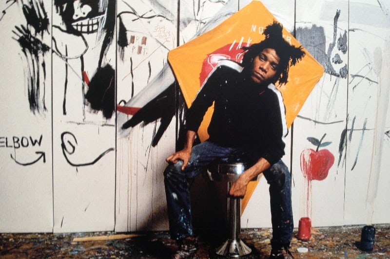
Words and phrases would remain a constant feature of his later artwork, portrayed in chaotic arrangements alongside rough figures and recurring motifs like crowns and skeletal anatomy. He is identified with the Neo-Expressionist movement in the 1980s for the rawness of his paintings, but Basquiat’s work is also iconic for its brazen appropriation and cultural fusion. Basquiat found inspiration everywhere—from art history (he reinterpreted work by Picasso and Leonardo), poets, jazz musicians, Black athletes, the Gray’s Anatomy textbook, classical literature, Haitian Vodou, and the streets of New York. He also combined materials, including oil-stick, crayons and spray paint. His relationships were equally mixed, with one former girlfriend describing his sexuality as “multichromatic.”


Being romantically fluid and multi-ethnic—a double minority—inspired the intersectionality of his most famous works, which often tackled systemic oppression head-on. 1981’s Irony of a Negro Policeman depicts the titular figure abstracted into an unnatural body, with a skull mask face beneath a Baron Samedi top hat crisscrossed by jail bars. Untitled (Skull) from the same year shows the head of a Black man with a network of Frankenstein stitches and a skeletal lower jaw. Although the image is so alive with color that it seems to move, the eyes are despondent, as though weighted with worldly knowledge. Basquiat’s focus on marginalized subjects and his merging of graffiti with classical art led to an expressive style that leant nobility to the figures he depicted.
Reimagining Vista’s logo in Basquiat’s style
Vista (whose parent company Cimpress earned a perfect score on the HRC’s Corporate Equality Index) has published company-wide guidelines on how to best support LGBTQ+ employees, including a series of LinkedIn Learning Modules. Rolling out a wave of new programs promoting inclusivity in the workplace, Vista sponsored virtual Pride speaker events featuring Bobby Burke, of Netflix’s Queer Eye, and a New England job fair for the trans community.
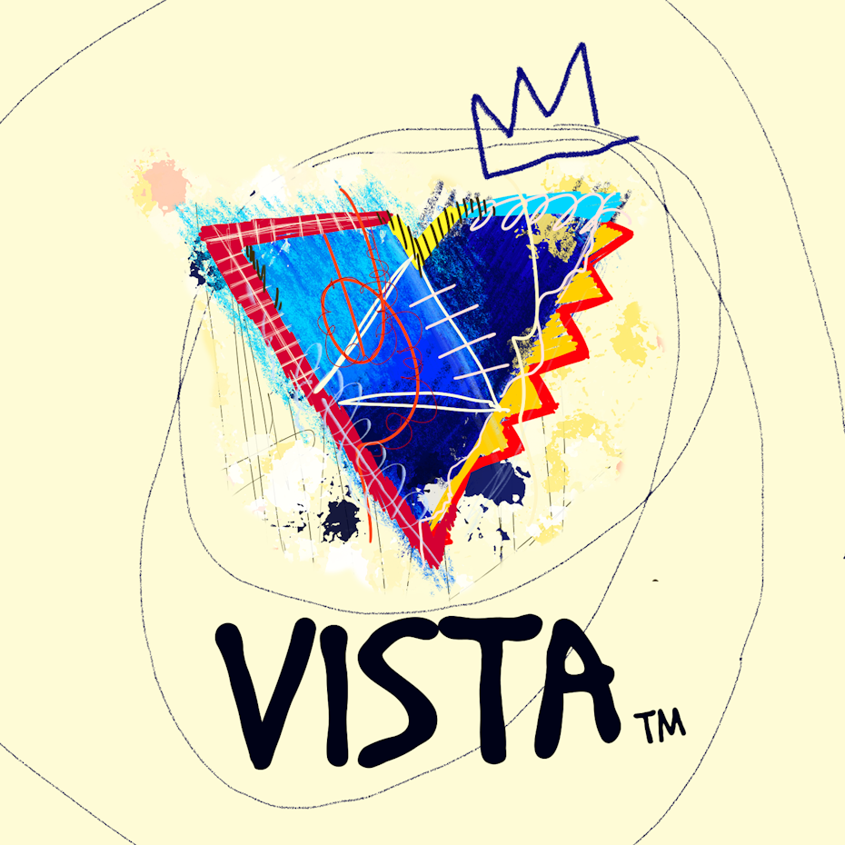
CCdesign ™’s Vista logo interpretation takes inspiration from Basquiat’s Untitled (Skull), creating a colorful patchwork image that comes alive with color and textures. Basquiat’s signature simplified crown echoes the points of the “V” while the crayon textures and loose doodles create a mesmerizing and exhilarating aesthetic. For CCdesign ™, Basquiat’s ability to create appealing forms by deconstructing provided an irresistible challenge, but the artist’s personal strength was the biggest source of inspiration. “He inspires me for being a bisexual black artist who dealt with all kinds of prejudice and that reflects a little bit how I feel as a designer from Latin America,” says CCdesign ™.
Celebrate Pride by celebrating queer art
—
Queer art is as old as art itself—with homoerotic love even finding its way onto cave paintings. But through the centuries-long legacy of the medieval church’s (literal) demonization and persecution of LGBTQ+ people, queer expression in all forms was forced back into the figurative cave. By the 20th Century, artists were able to express their identity and challenge gender norms indirectly, but it was the Pride marches and the activism they inspired that finally pulled LGBTQ+ art out of the shadows. That is why—year-round but especially in the month of June—we remember that we wouldn’t have LGBTQ+ rights and visibility (incomplete as they still are) if it hadn’t been for artists, activists, and everyday people bravely sharing their experiences at great personal risk.
As important as depictions of the LGBTQ+ community are in art and media, it is real-life meetings that often inspire change and understanding. The workplace (where we find people outside of our social circle) is now fairly a common setting for queer and non-queer people to interact, and that is why it is important for companies to foster a culture of LGBTQ+ inclusion. Because businesses depend on the labor of their workforce and the profit from their customers, they have a responsibility to support those same people who support them.
And the perspectives of diverse communities are what challenges a business to grow. The creative community at 99designs is made up of people from various international backgrounds, sexual orientations and gender identities, and we’ve experienced first-hand how embracing all facets of our humanity leads to better art and a better world.

