 Battle for Dream Island Logo PNG
Battle for Dream Island (BFDI) is not a company, but rather a popular animated web series. The mastermind behind this project is the animation company, Jacknjellify. The brainchildren of this endeavor, Michael and Cary Huang, established the series in 2010. The storyline revolves around a group of anthropomorphic objects vying for the grand prize: Dream Island. Set in the world of Goiky, it combines humor, adventure, and strategy. As for Jacknjellify, its main activities include producing the BFDI series and several spin-offs, and it operates primarily on platforms like YouTube.
Meaning and history
Founded by brothers Michael and Cary Huang in 2010, Jacknjellify is the animation force behind the successful web series, Battle for Dream Island (BFDI). Set in the whimsical world of Goiky, BFDI presents an array of inanimate objects battling it out for the chance to own the coveted Dream Island. Throughout the years, the series has metamorphosed from a simple competition-based animation to an intricate story with multiple seasons and spin-offs. Notably, it was among the pioneers of object animation shows on YouTube, gathering a large fan base and influencing many other creators. Presently, Jacknjellify continues to produce episodes and engage with their growing community, solidifying its position as a major player in the animation world.
What is Battle for Dream Island (BFDI)?
Battle for Dream Island (BFDI) is an animated web series created by the animation company Jacknjellify, founded by brothers Michael and Cary Huang. Launched in 2010, the show portrays anthropomorphic objects competing for the ultimate prize, the Dream Island. Operating mainly on YouTube, it’s recognized for its unique storytelling and has garnered a significant fanbase.
2008
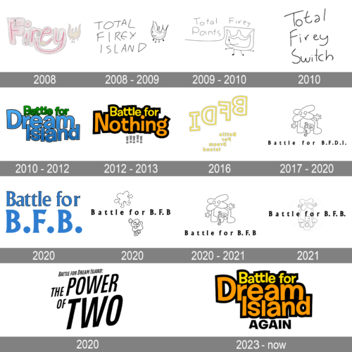
This playful and whimsical logo features the word “Firey” illustrated in a soft pink hue, with letters that seem to dance with each other. Each character holds its own charm, with elements like a little stick figure perched on the letter ‘F’ and a cute smiley face within the letter ‘O’. To the side, a tiny flame character with legs adds an endearing touch, symbolizing the word’s essence and encapsulating a sense of fun and creativity.
2008 – 2009

With a minimalist and freehand approach, this logo represents the words “Total Firey Island” in an irregular yet catchy font. The centerpiece is the simplistic representation of ‘Firey,’ embodied as a flame with legs, providing a humorous and light-hearted tone. The casual nature of the logo evokes feelings of spontaneity, making it stand out in its simplicity.
2009 – 2010

This design hinges on its hand-drawn allure, featuring the phrase “Total Firey Points” in a flowing, cursive style. The abstract depiction of ‘Firey,’ a flame figure with legs, playfully interacts with the words, lounging atop “Points” in a relaxed manner. The entire logo captures an informal and friendly vibe, indicative of a casual setting or environment.
2010

Boasting an almost childlike innocence, this logo presents the words “Total Firey Switch” in a scrawled font. Its rawness and lack of polish create an authentic, down-to-earth feel, resonating well with audiences seeking genuine experiences or products.
2010 – 2012
Dominated by shades of azure and emerald, this logo splendidly depicts the title “Battle for Dream Island.” The word “Dream” takes center stage in royal blue, closely enveloped by the accompanying text. It gives the impression of a grand quest or competition, alluding to a fantastical journey or challenge. The bold, 3D typography style enhances the feel of an epic saga, promising adventure and excitement.
2012 – 2013
Employing a stark contrast of black and gold, this logo exudes a sense of mystery and allure. The text “Battle for Nothing” is presented in a bold, energetic typeface that suggests a high-stakes competition, even if it’s for “nothing.” The three exclamation points amplify the urgency and emphasize the unexpectedness of what this “nothing” might represent, challenging perceptions and inviting curiosity.
2016
This unique variation of the “Battle for Dream Island” logo takes a more ethereal approach. Using a light yellow outline on a white canvas, it seems to challenge the viewer to look closer, to discover what’s hidden in plain sight. The inverse color scheme and mirrored text give it an otherworldly vibe, suggesting that this version of the Dream Island might exist in an alternate or reversed reality.
2017 – 2020
This monochromatic design prominently features two playful characters, standing atop the word “Battle.” The larger figure, with its cloud-like form and friendly gaze, appears to protect or mentor the smaller, star-shaped character. Beneath them, the abbreviation “B.F.D.I.” in bold capital letters hints at a broader context or story. The simplistic color palette emphasizes the characters and lettering, creating a memorable and engaging visual narrative.
2020 – now

This striking monochromatic design boldly presents the title “Battle for Dream Island: THE POWER OF TWO.” The typography is distinctly modern, with thick, imposing letters that dominate the visual space. Emphasis on “THE POWER OF TWO” underscores its significance, perhaps pointing to a central theme or concept. The juxtaposition of varied font sizes adds depth and interest, suggesting a narrative or hierarchy. The black-and-white palette is a timeless choice, conveying a sense of sophistication and gravity.
2020 (prototype)
A bold and prominent logo featuring the words “Battle for” in an elegant, deep blue script. Beneath this, the acronym “B.F.B.” is emphasized with larger, slightly italicized letters. The simplicity of the color palette, limited to varying shades of blue, gives the design a unified and sophisticated appearance. The typography of the logo, especially in the acronym, conveys strength and competition. Overall, the design is reminiscent of traditional sports logos, suggesting a contest of skill or perhaps a game-related theme.
2020
This black and white emblem incorporates playful graphics along with its title, “Battle for B.F.B.” A dotted-line cloud hovers above the text, hinting at a dreamy or imaginative setting. Under the writing is a quirky, cartoonish figure with big, expressive eyes and a hand raised in a playful gesture adds a whimsical touch. The character’s round eyes and mischievous smile evoke a sense of fun and adventure. This design perfectly marries simplicity with creativity, making it both memorable and engaging.
2020 – 2021
A minimalist outline logo displays a playful interaction between two cartoon characters. The larger figure, shaped like a cloud or star, envelops the title “Battle for B.F.B.”, serving as a backdrop. This character’s large eyes and outstretched arms lend it a protective or embracing demeanor. Beside it, a smaller figure appears to be jumping or dancing, bringing a dynamic and lively element to the composition. The fluid line art and open spaces in the design lend it an airy and light-hearted feel.
2021
Centered around the phrase “Battle for B.F.B.”, this design features a larger character looking somewhat perplexed or concerned. A prominent, square-ish accessory, resembling an electronic device or perhaps a portal, stands in front of this figure. A smaller, jovial character seems to emerge or interact with this device, suggesting a storyline or narrative behind the logo. The monochromatic color scheme highlights the playful and interconnected relationship between the two characters, giving depth to the otherwise simple design.
2023 – Today
Bursting with vibrant energy, this logo showcases the phrase “Battle for Dream Island AGAIN” in a dynamic and colorful design. The words “Battle for” are set in a more subdued tone, letting the main title, “Dream Island,” take center stage with its large, chunky letters. These letters play with a bright mix of yellows and oranges, evoking a sense of warmth, enthusiasm, and excitement. The word “AGAIN” is anchored at the bottom, hinting at a continuation or sequel. The overall design is youthful, catchy, and promises a lively and engaging experience.


