 Badger Brewery Logo PNG
Badger Brewery, nestled in the heart of Dorset, is a renowned British brewing company. Owned by the Woodhouse family for many generations, it has been a staple in the production of traditional ales. The brewery’s operations primarily span across the southern parts of England, where it has garnered a loyal customer base. With a dedication to crafting ales using locally sourced ingredients, Badger Brewery has been successful in establishing itself as a quality-driven brand. Over the years, it has retained its essence of heritage while evolving to meet the demands of modern ale enthusiasts.
Meaning and history

Founded in 1777 by Charles Hall in Blandford, Dorset, Badger Brewery has a rich history that spans over two centuries. The brewery’s reputation has been built on its consistent dedication to the craft of brewing and its ability to churn out traditional ales that resonate with the palette of its audience. Some of its key achievements include the creation of unique ale flavors, each rooted deeply in the traditions of Dorset but also appealing to contemporary tastes. The brewery’s commitment to quality and innovation has seen it win numerous awards and recognitions. Today, under the stewardship of the Woodhouse family, Badger Brewery continues to thrive and remains a respected entity in the world of British brewing.
What is Badger Brewery?
Badger Brewery is a historic British brewing company, founded in 1777 in Dorset. Renowned for its traditional ales, the brewery has been owned by the Woodhouse family for generations, emphasizing quality and local ingredients in their brews.
???? – 2018

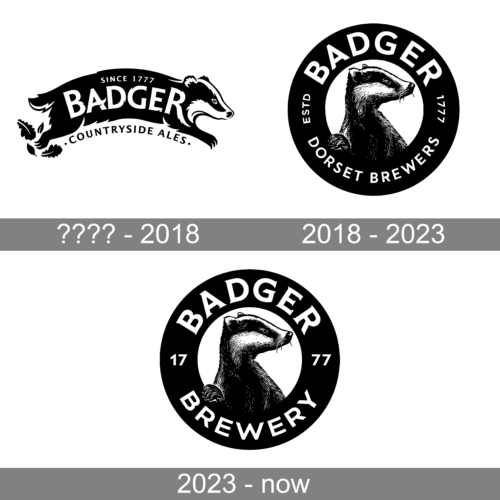
A dynamic portrayal of a badger in motion dominates this design. The badger, exquisitely detailed, seems to dash across, signifying momentum, energy, and forward movement. The logo beautifully captures the essence of countryside charm with leaves fluttering in the badger’s wake. Boldly atop the animal is the brand name “BADGER,” stamped with “SINCE 1777,” emphasizing the brand’s heritage. Below, “COUNTRYSIDE ALES” reiterates the brand’s specialization, promising quality brews. The design’s fluidity, combined with stark monochromatic shades, evokes feelings of tradition melded with contemporary artistry.
2018 – 2023

This emblematic design showcases a meticulously detailed badger, exuding confidence and grace, set against a circular backdrop. The animal’s drooping whiskers and forward-facing gaze captivate the viewer’s attention. Around the badger, the words “BADGER” and “DORSET BREWERS” form an embracing arc, indicating the brand’s strong association with brewing. A date “ESTD 1777” at the top signifies the brand’s longstanding history, showcasing the experience and legacy in the brewing domain. The contrasting black and white palette provides a timeless appeal, ensuring the logo stands out and leaves a lasting impression.
2023 – Today

The logo showcases a striking and intricately detailed illustration of a badger, its proud stature immediately commanding attention. The badger, with its sharp eyes and poised stance, seems to be both vigilant and contemplative, reflecting a sense of tradition and authenticity. Whisker details, the sheen on its fur, and the subtle nuances in its facial features are meticulously rendered, emphasizing a commitment to craftsmanship and attention to detail.
Circumscribing the badger is a bold, circular band, where the word “BADGER” is prominently embossed in bold, capitalized letters, signaling dominance and brand recognition. The design choice to make the name the most prominent feature ensures that the brand’s identity is unmistakably conveyed to the viewer. Beneath the brand name, the word “BREWERY” is featured, hinting at the nature of the business and the artisanal products they might offer. The circular design element evokes a sense of unity and continuity, suggesting a well-rounded and holistic approach to their craft.
Flanking the badger on either side, within the circular band, are the numbers “17” and “77”. This numerical detail might allude to a significant year in the brand’s history, perhaps its establishment, adding an element of heritage and longevity to the logo’s narrative. The choice of a monochrome color palette, with its stark contrast between black and white, further accentuates the logo’s classic and timeless appeal. Overall, this logo beautifully amalgamates tradition with modern design principles, promising quality, authenticity, and a rich legacy.


