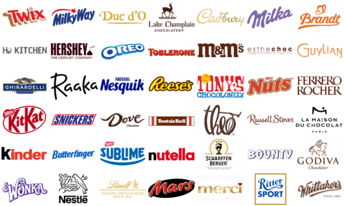
The confectionery industry’s logos are storytellers, imbuing brands with narratives that align with consumer tastes and dreams. Chocolate manufacturer’s emblems blend artistry with business, designed to entice and stir emotions as complex as the flavors they represent.
These logos stand as brand ambassadors, combining heritage, imagination, and the allure of quality into their design. They promise flavor and pleasure with every glimpse, encapsulating the joy of chocolate in a singular symbol.
The chocolate sector, rooted in tradition yet spanning the globe, showcases a variety of logos that narrate a story of diversity. Artisanal origins inspire traditional scripts, while whimsical swirls invite consumers into realms of fantasy, and bold typography heralds contemporary delights-each contributing to a broader narrative.
Beyond mere marks, these icons speak a visual language of longing, connecting a brand’s legacy with the consumer’s experience and crafting a timeless appeal. Delving into iconic chocolate logos reveals the interplay of culture and creativity that has sculpted them. In the realm of chocolate logo design, creativity merges with sensory appeal, igniting desire, engaging the appetite, and capturing hearts.
Bounty
Bounty, with its distinctive blend of coconut filling and milk chocolate coating, has delighted taste buds since Mars, Incorporated introduced it in 1951. It’s a favorite for those who enjoy the tropical taste of coconut perfectly mixed with smooth, rich chocolate. The logo features a deep blue, thick serif font, encircled by a thin yellow border. Each letter’s interior resembles stitching or fabric, hinting at the brand’s commitment to quality and reliability. The contrast between the yellow outline and the blue background suggests a classic, trustworthy color scheme.
Brandt Zwieback
Brandt Zwieback, known since 1912 for its crispy, sweetened bread rusks, has become a staple in European households. It’s particularly famed as a mild, digestible option for infants and those with sensitive stomachs, representing tradition and quality. The logo showcases a playful, dynamic script in bright orange. The oversized ‘B’ captures attention, adorned with a cursive flourish that resembles a heart, symbolizing love or passion for the brand. The rest of the letters, ‘randt’, are connected by a fluid underline, emphasizing movement and fluidity.
Butterfinger
Introduced in 1923 by the Curtiss Candy Company and now produced by Ferrero, Butterfinger is known for its crunchy peanut butter core and chocolate coating. Its catchy slogan “Nobody better lay a finger on my Butterfinger” has made it a unique and beloved part of American candy culture. The logo employs a bold, blue, blocky sans-serif font. Each letter is capitalized, with the ‘B’ at the beginning standing taller, creating a visual hierarchy. A burst-like shape dots the ‘i’ in ‘Butterfinger’, adding a playful, fun element. The slight forward tilt of the letters suggests progress and momentum.
Cadbury
Since its establishment in 1824, Cadbury has been a symbol of quality and innovation in the confectionery world. Now part of Mondelez International, it’s globally celebrated for products like Dairy Milk chocolate, Creme Eggs, and Roses selection boxes. The logo features ‘Cadbury’ in an elegant, cursive script, reminiscent of a personal signature, evoking tradition and a personal touch. The letters, in a soft, golden hue with a subtle gradient, add depth and luxury, reflecting the brand’s indulgent product range.
Dove
Introduced by Mars, Incorporated in the 1950s, Dove chocolates, also known as Galaxy in some regions, have become a hallmark of luxury and comfort in confectionery. Their silky texture and rich taste span a variety of products from milk to dark chocolate. The ‘Dove Chocolate’ logo mirrors this luxury, with its design reminiscent of flowing, melted chocolate. ‘Dove’ appears in a playful, curvy font, symbolizing the creamy chocolate texture. The word ‘Chocolate’ contrasts in a straightforward, sans-serif type, grounding the logo with clarity.
Duc d’O
Belgian chocolatier Duc d’O, established in 1983, is renowned for its exquisite pralines and truffles, often encased in elegant packaging. This brand blends traditional Belgian techniques with innovative flavors, signifying excellence in chocolate-making. Its logo, featuring the ‘Duc d’O’ name, uses a bold, hand-painted-like font. The chunky, textured letters convey rustic, artisanal charm, emphasizing craftsmanship and product uniqueness. A thin, erratic line below the text enhances the handmade feel.
Esthechoc
Esthechoc stands as a trailblazer in the chocolate industry, merging premium dark chocolate indulgence with health and beauty advantages, particularly in enhancing skin health through high antioxidant levels. Its logo, ‘esthechoc’, showcases a minimalist, modern design in a deep chocolate hue, reflecting the main ingredient. The name, a blend of ‘esthetics’ and ‘chocolate’, underscores the brand’s commitment to beauty and indulgence. Beneath it, “Cambridge Beauty Chocolate” in a smaller font connects the brand to Cambridge’s academic and research prestige, emphasizing its unique position as a beauty-enhancing chocolate.
Ferrero Rocher
Ferrero Rocher, launched in 1982 by Italian chocolatier Ferrero SpA, is known for its unique gold foil-wrapped spherical chocolates. These luxurious confections, with a whole hazelnut inside a thin wafer shell filled with hazelnut cream and coated in milk chocolate and chopped hazelnuts, epitomize sophistication in chocolate confectionery. The ‘Ferrero Rocher’ logo, in an elegant serif font, radiates luxury and tradition. Its rich, chocolate-brown color reflects the brand’s iconic chocolates. The capitalized letters with sharp, thin serifs add refinement, while their close spacing creates a unified, solid appearance.
Ghirardelli
Founded in 1852 by Italian chocolatier Domenico Ghirardelli, the Ghirardelli Chocolate Company stands as one of the oldest chocolate brands in the United States. It symbolizes San Francisco’s rich history with its range of premium chocolates, known for intense flavors and a smooth texture. The logo features a regal blue rectangle background, with the brand name in bold, serif, creamy white letters, suggesting purity and quality. Above the name, a golden eagle with wings spread wide clutches a ribbon stating “Founded in 1852”, infusing the brand with historical significance. This eagle symbolizes freedom and excellence, adding heritage and authenticity to the brand’s identity.
Godiva Chocolatier
Godiva Chocolatier, established in 1926 by Joseph Draps, is a beacon of luxury in Belgian chocolate making. It offers gourmet truffles, bars, and handcrafted delights. The logo exudes luxury with its sophisticated, script-like serif font. The classic chocolate-brown color reflects the brand’s premium chocolates. Above the brand name, a detailed illustration of Lady Godiva on horseback adds narrative and historical depth, reinforcing the brand’s rich legacy.
Guylian
Established in 1958 by Guy and Liliane Foubert, Guylian is known for its signature seashell-shaped pralines crafted from a unique blend of West African cocoa beans. The logo uses a soft, rounded sans-serif typeface, giving it a modern, welcoming look. Its warm, peachy orange color mirrors the richness of Belgian chocolate.
Hershey
Hershey, an American confectionery giant founded in 1894 by Milton S. Hershey, transformed chocolate production with mass-production techniques. Its products, like Hershey’s Milk Chocolate bars and Reese’s Peanut Butter Cups, are nationally cherished. The logo displays the company’s name in a deep maroon, using a bold, serif font that conveys tradition and trustworthiness. Below, “The Hershey Company” appears in a smaller, simpler font, emphasizing the brand’s corporate essence.
Hu Kitchen
Launched in 2012, Hu Kitchen pioneered the clean eating trend, specializing in organic chocolates that are minimally processed and free from refined sugars, gluten, and dairy. This approach caters to those seeking simplicity and purity in their chocolate choices. The logo features a minimalist, sans-serif font, offering a modern and uncluttered look. The ‘Hu’ in “Hu Kitchen” is unique, incorporating a human figure into the ‘u’, symbolizing the brand’s commitment to health and wellness. This figure seems to hold a circle aloft, representing a holistic approach to food. The logo’s muted gray color conveys organic quality and simplicity.
Kinder

Kinder, a division of the Italian confectionery giant Ferrero, made its debut in 1968. It is celebrated for its child-friendly chocolate assortments, including Kinder Surprise, Kinder Bueno, and Kinder Joy, blending fun with creamy, delicious chocolate. The logo uses a lively red, energetic and inviting, especially appealing to its young audience. Its bold, rounded font is friendly and approachable.
Kit Kat
Kit Kat, under Nestlé’s global ownership and Hershey’s in the United States, has been a favorite since 1935. Known for its catchy slogan “Have a break, have a Kit Kat” and its unique format of wafer biscuit bars covered in smooth chocolate, it offers a perfect mix of crispiness and creaminess. The “Kit Kat” logo stands out with its striking red oval background and contrasting white lettering. Its bold, sans-serif font, with some letters slightly tilted, adds a dynamic, playful vibe. The red and white color scheme is synonymous with energy and fun, mirroring the brand’s position as a delightful snack.
Lake Champlain Chocolates
In 1983, Vermont saw the birth of Lake Champlain Chocolates, a brand renowned for its handcrafted, small-batch chocolates that utilize local ingredients like fresh cream and maple syrup. The brand offers gourmet products ranging from truffles to sea salt caramels, embodying a dedication to quality and artisanal craftsmanship. The logo features a gracefully stylized deer poised over water ripples, creating a tranquil, natural image. Its classic, serif font adds elegance and timelessness, while the chocolate brown color palette underscores the brand’s commitment to high-quality, natural chocolate.
La Maison du Chocolat

Founded in Paris in 1977 by Robert Linxe, La Maison du Chocolat stands as a symbol of French elegance and excellence in chocolate craft. Known for its fine ganaches, truffles, and pralines made from premium cocoa and innovative flavors, the brand represents luxury in the chocolate world. The logo radiates chic Parisian sophistication with its sleek, modern sans-serif font. An elegant graphic, resembling an ‘M’ with a dot above it, crowns the text, possibly symbolizing a person or a chocolate piece. The addition of “PARIS” in smaller letters below bolsters the brand’s connection to French luxury and culinary distinction.
Lindt
Since its establishment in 1845 in Switzerland, Lindt & Sprüngli has been acclaimed for revolutionizing chocolate making with its conching process, leading to smoother, richer chocolate. The brand is known for its Lindor truffles and a variety of premium chocolate bars, representing Swiss chocolate artisanship. The logo employs a sophisticated script font in golden hues, signifying the brand’s premium status. Below the brand name, “Master Chocolatier Since 1845” emphasizes the company’s longstanding chocolate-making tradition. An emblem featuring a stylized, ornate dragon adds a touch of heritage and craftsmanship to the brand’s identity.
Mars
Mars, Incorporated, established in 1911, has become a major player in the global confectionery, food, and pet food industries. Known for the Mars bar and other favorites like M&Ms, Snickers, and Twix, the company has been instrumental in shaping the modern confectionery market. Its logo uses a bold, red font with a shadow effect for depth and impact. The letters, styled with curves, echo the smooth, rounded shape of the classic Mars bar. Set against a dark, oval backdrop, the logo is striking, conveying richness and indulgence.
Merci
Introduced in 1965 by Storck, a German company, Merci has gained fame for its exquisite selection of individually wrapped European chocolates, often shared as a sign of gratitude. Celebrated for its rich variety of flavors and textures, Merci embodies the essence of giving and appreciation in the form of confectionery. The logo features a simple yet elegant font in gold, reflecting luxury and quality. Uniquely, the ‘i’ in “Merci” is topped with a red heart instead of a dot, highlighting the brand’s name, which translates to “thank you” in French, and symbolizing the act of expressing gratitude with chocolate.
Milka
Originating in Switzerland in 1901 and now produced by Mondelez International, Milka is famed for its lilac-colored packaging and creamy milk chocolate made from Alpine milk. The brand offers a variety of chocolate bars and products that have captivated consumers globally. The “Milka” logo utilizes a soft, flowing script font in the brand’s hallmark lilac color, a tribute to its Alpine milk ingredient, famously represented by the purple cow. The font style mirrors the smooth, comforting texture of Milka chocolates.
Milky Way
Mars, Incorporated introduced the Milky Way bar in 1923, a popular chocolate treat with a unique blend of nougat and caramel coated in milk chocolate. Inspired by a malted milk drink rather than the galaxy, it has become a favorite in candy aisles worldwide. The “Milky Way” logo employs a cheerful, rounded sans-serif font in deep blue, creating a whimsical, delightful feel. A sweeping red arc over the text, culminating in a star, alludes to a shooting star or the galaxy theme suggested by the name. The combination of blue and red offers a visually striking and memorable contrast.
M&M’s
Mars, Incorporated unveiled M&M’s in 1941, captivating audiences with these colorful, button-shaped chocolates featuring a letter ‘m’ on each piece, enclosed in a candy shell to avoid melting. Known for playful marketing, M&M’s offer a range of flavors and types, like peanut and pretzel, becoming an iconic American snack. The “M&M’s” logo depicts the brand name in a bold, brown font, symbolizing the chocolate inside. The lowercase ‘m’s are round, resembling the candies, while the ‘&’ is playfully looped, reflecting the brand’s fun nature. The brown color underscores the chocolatey essence of the product.
Nesquik
Launched in 1948 as a chocolate milk powder, Nesquik, under the Nestlé umbrella, has achieved global popularity with its array of flavors and products like syrups and ready-to-drink beverages. It has become a go-to choice for flavored milk enhancements, attracting both children and adults. The “Nesquik” logo features a lively blue name in a rounded, kid-friendly sans-serif font. The “Nestlé” wordmark, positioned above “Nesquik”, links the product to its renowned parent company, emphasizing quality. The font’s roundness and the choice of blue are specifically designed to appeal to the brand’s younger consumer base.
Nestlé
Founded by Henri Nestlé in 1866 in Switzerland, Nestlé has evolved into a leading global food and beverage corporation. Its extensive product range, including chocolates, dairy items, and coffee, showcases its commitment to innovation and quality. The “Nestlé” logo depicts a mother bird feeding her chicks in a nest, a direct nod to the company’s name, which translates to “little nest”. This imagery conveys warmth and nurturing, representing care and quality. Beneath this, the company’s name is presented in bold, sans-serif letters, offering a contemporary contrast to the traditional imagery above.
Nutella
Ferrero introduced Nutella in 1964, and it has since become a beloved hazelnut cocoa spread worldwide, celebrated for its unique flavor and versatility in recipes. It has secured its place as a household staple across various continents. The “Nutella” logo is straightforward and impactful, featuring the brand name in a robust, sans-serif font. The striking red color captures attention and embodies the energy and passion associated with the brand. The “t” in “Nutella” are uniquely designed with gentle curves, adding a playful touch that mirrors the brand’s whimsical and fun character.
Nuts
Part of the Nestlé family, the Nuts chocolate brand is known for its unique blend of a whole hazelnut, chewy caramel, and creamy milk chocolate. This combination delivers a delightful mix of textures and flavors, making it a popular treat in numerous markets. The “Nuts” logo is vibrant and lively, with a warm red color and a yellow outline that communicates energy and excitement. The brand name is displayed in a fun, rounded sans-serif font, reflecting the playful essence of the candy. The presence of the “Nestlé” name above the logo in smaller text firmly ties the brand to its reputable parent company.
Oreo
Oreo, best known for its classic black and white sandwich cookies and owned by Mondelez International, has branched out into the chocolate segment. The brand now offers chocolate bars and candies that blend Oreo cookie pieces and vanilla cream filling with rich chocolate, introducing a novel take on the beloved cookie flavor. The “Oreo” logo sports bold, thick letters in a signature bright blue. The font’s playful, dynamic style is evident, with the ‘O’s mimicking the shape of the cookie. A red swoosh above the name adds a contrasting color burst, enhancing the logo’s visibility and appeal.
Raaka Chocolate

Raaka Chocolate, originating in Brooklyn, New York, distinguishes itself by producing unroasted, ‘virgin’ chocolate. This approach showcases the authentic and distinct flavors of cacao. The brand is also committed to ethical sourcing and transparent trade practices, positioning itself as a trailblazer in the craft chocolate sector. The “Raaka Chocolate” logo features a refined, minimalist design. It utilizes a black font with clean lines and modern serifs, embodying sophistication. The distinctive design of the ‘R’ and ‘k’ adds artistic character, reflecting the brand’s emphasis on craft and organic chocolate.
Reese’s
Since 1928, Reese’s, a Hershey Company brand, has been an American favorite for its peanut butter cups. It offers a unique blend of creamy peanut butter and milk chocolate and has expanded to include various shapes, sizes, and chocolate varieties. The logo showcases a script-style font with the brand name in flowing cursive. The bold, bright yellow letters, outlined in thick brown, mimic a chocolate-like appearance, symbolizing the brand’s association with peanut butter cups and chocolate treats. The stylized larger first letter, with a tail underlining the word, enhances the logo’s playful and dynamic nature. The yellow and brown color scheme represents the brand’s key ingredients: peanut butter and chocolate.
Ritter Sport
Founded in Germany in 1912, Ritter Sport is known for its practical square chocolate bars, an idea from Clara Ritter, and offers a wide range of flavors and fillings. The brand embodies a commitment to quality, variety, and sustainability in chocolate production.
The logo has a formal, traditional look with a serif font, signaling reliability and quality. Written in deep blue, the brand name features a notably larger ‘R’ with an elongated leg looping back to cross the letter, creating a unique visual aspect. The subtle serif touches reflect a refined taste, consistent with the brand’s high-quality chocolate image. The logo, encased in a gold-based rectangular frame with a thin black outline, adds elegance and formality. This design symbolize the brand’s signature square chocolate bars. The blue and gold color palette evokes a sense of premium quality and tradition.
Russell Stover
Since its establishment in 1923, Russell Stover has risen to become a major American fine chocolate manufacturer. The brand is known for its boxed chocolates, seasonal candies, and sugar-free options, capturing the essence of traditional American confectionery and gift-giving. The logo blends classic and contemporary styles with an elegant script font, reflecting a handcrafted touch. This font, in rich chocolate brown, mirrors the confectionery’s main product. The letters, connected seamlessly, evoke the continuous pleasure of chocolate indulgence. The larger, extended strokes of the initial ‘R’ and ‘S’ impart a signature-like quality to the logo, signifying a personal commitment to quality and tradition in chocolate making.
Scharffen Berger
Scharffen Berger Chocolate Maker, a forerunner in the American craft chocolate movement since 1996, is acclaimed for its artisanal, high-quality chocolates made through a bean-to-bar process. The logo exudes regality and heritage. It features a circular emblem with a stylized goat on a mountain peak, possibly representing the brand’s high standards and peak quality. The goat, dynamic in contrasting black, stands out against a golden circular background adorned with four stars, likely symbolizing excellence. The brand name appears below in bold, sans-serif type, split into two lines and “CHOCOLATE MAKER” in a smaller font, clearly conveying the brand’s artisanal focus. The black and gold color scheme underscores the brand’s luxury and premium market positioning, combining old-world craftsmanship with modern precision.
Snickers
Introduced in 1930 by Mars, Incorporated, Snickers bars have soared in popularity worldwide, known for their blend of nougat, caramel, peanuts, and milk chocolate. The Snickers logo contrasts sharply with its bold, assertive design. Set in a heavy, block-like serif font, the capitalized letters in solid blue express robust flavor and satisfaction. Encased in a red and white border, the logo acquires a dynamic, sporty appearance. The blue, white, and red color scheme suggests strength and reliability, aligning with the brand’s image as a hearty, energizing snack.
Sublime Chocolate
Sublime Chocolate, a boutique chocolate brand, stands out with its handmade, artisan chocolates, showcasing creative flavors and high-quality ingredients. This commitment to craftsmanship and culinary art is evident in the world of chocolate. The Sublime Chocolate logo is playful and inviting. The brand name, in a rounded, sans-serif font and bold vibrant blue, is eye-catching. Above the name, a red heart-shaped Nestle logo symbolizes love and passion, likely for the brand and the joy of chocolate. A curving blue line below the name adds a sense of motion and joy, hinting at the blissful experience of consuming their chocolate. The unconventional use of blue in the logo may suggest a unique chocolate experience.
Theo Chocolate
Since its inception in 2006 in Seattle, Theo Chocolate has led the way in organic and fair trade-certified chocolate in North America. The brand is committed to ethical sourcing and sustainability, offering a diverse array of unique, high-quality chocolate products.
The whimsical and artistic logo of Theo Chocolate features the brand name in a fluid, script-like font, mirroring the company’s organic and natural approach. The deep, rich chocolate brown color evokes the essence of cocoa beans. A cleverly integrated cacao pod at the end of the “o” complements the design. The font’s handmade appearance, with varying stroke thickness, highlights the chocolate’s artisanal quality. The “T” stretches upwards, while the “h” flows below, leading into the “o” that forms the base of the cacao pod, symbolizing the brand’s bean-to-bar philosophy.
Toblerone
Toblerone, established in Switzerland in 1908, is famous for its unique triangular shape and its blend of honey, almond nougat, and chocolate, symbolizing Swiss chocolate innovation and artistry. The bold Toblerone logo employs an angular, serif font mirroring the chocolate’s iconic triangular pieces. The gradient of red and orange in the letters adds depth and sophistication, possibly representing the chocolate’s indulgent flavor. The typography, with its sharp, mountain-like edges, reflects Switzerland’s terrain, where the chocolate is crafted. This design conveys a sense of adventure and quality, fitting for a brand celebrated for its distinctive shape and Swiss chocolate legacy.
Tony’s Chocolonely
Tony’s Chocolonely, founded in the Netherlands in 2005, has achieved global recognition for its commitment to 100% slave-free chocolate. Its colorful packaging and uniquely segmented bars challenge industry norms and promote ethical chocolate production.
The logo is vibrant and playful, with an irregular typeface that adds a whimsical touch. The varying sizes and orientations of the letters, especially the tilted “O” in “TONY’S”, enhance this playful feel. The striking red and blue color scheme dominates the logo, with red in the upper part and blue below. A central yellow circular seal showcases a broken chain, along with text highlighting the brand’s fair trade commitment. This seal acts as a badge of the company’s ethical values, making a bold statement about their commitment to fairness.
Tootsie Roll
Tootsie Roll Industries, an American confectionery icon, has been producing the Tootsie Roll since 1896. This unique, chewy chocolate candy has become a cultural staple, famous for its long-lasting chew and distinctive wrapper. The Tootsie Roll logo reflects classic Americana, using a simple, rounded font that evokes nostalgia and tradition. Set against a chocolate brown background, it reinforces the candy’s identity. Red and white vertical stripes flank the text, reminiscent of a flag, subtly alluding to the candy’s enduring presence in American culture. The logo’s straightforward design communicates the reliable, no-nonsense character of the candy.
Twix
Launched in the UK in 1967 and later in the US in 1979 by Mars, Twix has gained fame for its unique mix of crunchy cookie, smooth caramel, and creamy chocolate, offered in twin bars. Known for the playful tagline “Two for me, none for you”, it stands out in the confectionery market. The Twix logo is a dynamic display of energy and motion. Its forward-slanting, bold red letters suggest speed and excitement. A pause symbol stylishly forms the ‘I’, symbolizing a moment to savor the treat. Golden dots in the background echo the cookie and caramel layers. The modern, sans-serif font gives a contemporary, approachable look, while the red and golden color contrast enhances its playful, indulgent appeal.
Whittaker’s
Whittaker’s, a prominent chocolate brand from New Zealand established in 1896, is celebrated for its dedication to quality, offering an extensive range of 100% New Zealand-made chocolates. Voted multiple times as New Zealand’s most trusted brand, it has a rich heritage. The Whittaker’s logo reflects this heritage and commitment to quality with a script typeface that suggests history and craftsmanship. The robust, flowing letters, especially the elaborately curled ‘W’ and ‘s’, evoke chocolate swirls. Its dark brown color mirrors the chocolate, emphasizing an indulgent experience. The tagline “SINCE 1896” in a dignified serif font underlines the brand’s long and storied history.
Wonka
The Wonka brand, inspired by Roald Dahl’s “Charlie and the Chocolate Factory” and operated under Nestlé, brings to life a world of imaginative and colorful sweets, reminiscent of Willy Wonka’s fictional chocolate factory. The logo captures this whimsical essence. It uses a playful, cursive font that twists and turns, embodying the fantastical factory. The ‘W’ in the logo elegantly swirls above the other characters, signifying the magical experiences the brand offers. Its royal purple color symbolizes creativity and originality, fitting the brand’s inventive and unconventional spirit.


